Magnificent Mucha

An interview from the Identifont Blog, reproduced with permission

Alphonse Mucha is a decorative font with an Art Nouveau look about it. What inspired you to design it? 

The font is based on lettering by the Czech artist Alphonse Mucha for a 1913 concert poster for the cellist Zdeňka Černý. Zdeňka Černý was an American virtuoso cellist, the daughter of a friend of Mucha. The poster was designed to publicise a European tour to begin in 1914 which had to be cancelled due to the war to end all wars.

I’ve loved Mucha’s work since the late 1960s. For my generation, the resurgence of interest in Art Nouveau, of Mucha and Aubrey Beardsley particularly, was part of the countercultural vibe at the time. Several K-Type fonts spring from similar early enthusiasms, and what fascinates you in your youth tends to stay with you.

You’ve written that Alphonse Mucha was developed from the nine letters in a concert poster by the Czech artist Alphonse Mucha for the cellist Zdeňka Černý. That leaves 43 upper and lower-case letters to design, not to mention the digits and punctuation! How do you set about doing this?

The main inspiration was the Černý poster with its distinctive top-heavy letterforms. Top-heavy could easily spawn awkward and unwieldy, so the mission was to design letters and numbers that maintained the grace and uniformity of those nine capitals, to create an elegant evenness of type colour throughout. 

I looked closely through Mucha’s poster work for letterforms that were somewhat compatible, though for most characters I just accessed my inner Mucha and designed from scratch. I really enjoy the task of making a whole character set from the starting point of a few letters, just as the Keep Calm font developed from the twelve capital letters of the original wartime poster. It’s a thrilling way to work.

Did you look at any other typefaces for inspiration? The closest I could find on Identifont is Artistik by Monotype Design Studio.

 Not really. My source material, such as it existed, was Mucha’s poster lettering. Mucha did include an alphabet design on a page of his 1902 portfolio, Documents Decoratif, and there are several fonts based on this character set, but they are quite different to the K-Type font and its inspiration.

With a typeface like Alphonse Mucha that looks like it’s drawn with brushstrokes, do you experiment with letter shapes with ink on paper, or do you work entirely on the computer?

Mucha drew highly stylised brushstrokes, so I didn’t feel the need to use ink or paint, though I tried to preserve the simulated brush style. 

If I’m making a more geometric font I’ll tend to design directly on computer, but if it’s a more ornate face I’ll sketch letters in pencil and scan the roughs, which is what I did with Alphonse Mucha.

K-Type Penny Lane for Eurovision 2023

With the 2023 Eurovision Song Contest being staged in Liverpool on behalf of Ukraine, the choice of the Penny Lane typeface proved a perfect fit. The fonts are based on twentieth-century cast-iron signs displaying Liverpool street names, and signify the city’s rich musical heritage.

Although the lettering used for vintage street signs varies in width and style, the semi-condensed Penny Lane Bold is fairly typical. The waist of letters like X and Y is positioned on the midline so may appear unusually high, the G is without a crossbar, and pointed characters like the Z might seem at odds with generally grotesque letter shapes.

Penny Lane is a straightforward, usable sans that looks modern and has a fresh lowercase with a healthy x-height designed for clarity; the fonts have been inspired by street sign lettering rather than insensitively tied to historical accuracy. A full complement of Latin Extended-A characters is included.

The Summer of Love Revisited

K-Type’s Monterey Pop display face is inspired by Tom Wilkes’s celebrated poster for the 1967 Monterey Pop Festival which heralded the Summer of Love. Although influenced by the psychedelic styles of Wes Wilson, Victor Moscoso, Rick Griffin and others, Wilkes’s lettering is a uniquely individual interpretation of the countercultural vibe.

Lou Adler commented, “Most of the artwork in that particular culture was coming out of San Francisco, and what Tom did was he took a San Francisco look, or niche, and made it international. You can see a lot of the posters from that period and say, ‘Oh, that’s the ‘60s.’ With Tom, it isn’t dated. There’s a very special look to it.” (Los Angeles Times, 2009)


The poster launched a career in design and art direction within the music industry, with Wilkes embracing a wide range of visual styles and amassing an impressive catalogue of record sleeve artwork including Neil Young’s Harvest, and working with photographer Barry Feinstein, Captain Beefheart’s Safe As Milk and George Harrison’s All Things Must Pass album covers. However, Wilkes’s alphabetical inventiveness was never again as inspired and original as it was for his 1967 poster.

The three new fonts remain faithful to Wilkes’s capitals and numerals, add a sympathetically designed lowercase, and include a full repertoire of Latin Extended-A characters. In addition to the normal font, two contour versions are provided – the Outline font works well for darker lines, and the Thinline font is designed for white and tinted outlines which can tend to halo and appear slightly bolder.

K-Types on Telly

K-Type Keep Calm is the typeface of choice for BBC quiz show, Richard Osman’s House of Games.

In addition to extensive use of the uppercase for the strong, elegant headings throughout the show, the newly-designed lowercase, selected for its superb legibility and reliability, is used for quiz captions and end credits.

Also cropping up on the box is K-Type Penny Lane, appropriately chosen for the title graphic and break bumpers to the Carpool Karaoke special, When Corden Met McCartney.

The Source of the Miles

K-Type’s Banks & Miles fonts are inspired by the geometric monoline lettering created for the British Post Office by London design company, Banks & Miles, a project initiated and supervised by partner John Miles. The ‘Post Office Double Line’ alphabet was created in 1970 from sketchbook ideas that John Miles had started working on the previous year,
“I had been enjoying myself seeing how far I could push basic geometry in designing an inline alphabet and we decided to develop my original sketches”.

John Miles acknowledges the contributions of David Deadman, Peter Taylor, Colin Banks, and the other designers at Banks & Miles,
“This was mainly my project but I had a lot of help from some very talented people in the studio so in the end it was a Banks & Miles production. I was very keen that it should be visually a monoline letter which meant we had to compensate for the optical illusion between vertical and horizontal line of the same width. This was particularly difficult in the curved letters. Although we used geometric shapes as far as possible there were points at which only free hand rendering would do the trick.”

The brief required that the component parts of the Post Office, which included telecommunications, counter services and the Royal Mail, be visually linked whilst still retaining each individual identity. A shortlist of four companies was selected with each being offered £2000 (worth around £30,000 today) and given around three weeks to prepare their pitch. Banks & Miles’s idea of a distinctive alphabet, in different colours to indicate the distinct parts of the Post Office business, ultimately proved most appealing to the Post Office Design Committee, and in July 1970 their proposal triumphed over distinguished competition from the Design Research Unit, Conran Design and Crosby/Fletcher/Forbes (Pentagram).

The Double Line name emphasised a key aspect of the design; whereas earlier inline styles were created by drawing the inlines through the middle of existing letterforms, John Miles’s letters were designed elegantly around their inlines.

An additional Single Line version called Post Office Medium was created for subheadings and secondary wording, and rather than simply remove Double Line’s inline, the supplementary alphabet was designed anew and slightly condensed where required, though R and k also became more conventional in the process losing their more distinctive Double Line forms, and the number 2 lost its pointed vertex, no longer matching the 4, 7 and Z.

Even after the Post Office was split into separate businesses in the 1980s, Post Office Counters and Royal Mail continued to use the Double Line alphabet, and a version can still be seen within the Royal Mail cruciform logo.

The original lettering was conceived as an alphabet rather than a typeface, so in creating the Banks & Miles fonts, K-Type has necessarily reinterpreted the original letterforms, making changes, aligning the Single Line more closely to its parent, and creating many new glyphs in order to function well as digital type and provide good results in print and on screen. The fonts have been carefully spaced and kerned, and include a full set of Latin Extended-A characters.

I am grateful to John Miles for the inspiration and his recollections about the origin of the alphabets. I am also grateful for the help of Paul Luna at Reading University and Matthew Standage whose dissertation on the lettering proved fascinating and illuminating. Thanks to Andrew Emmerson for suggesting the project, and for providing samples and examples of the Double Line and Medium alphabets.

Reviving Curwen Sans

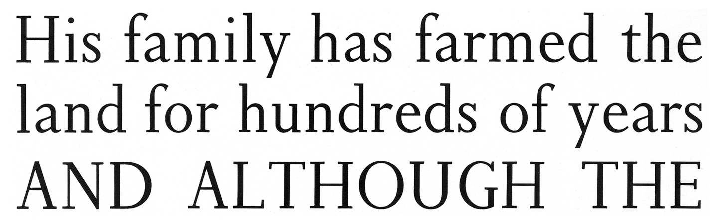
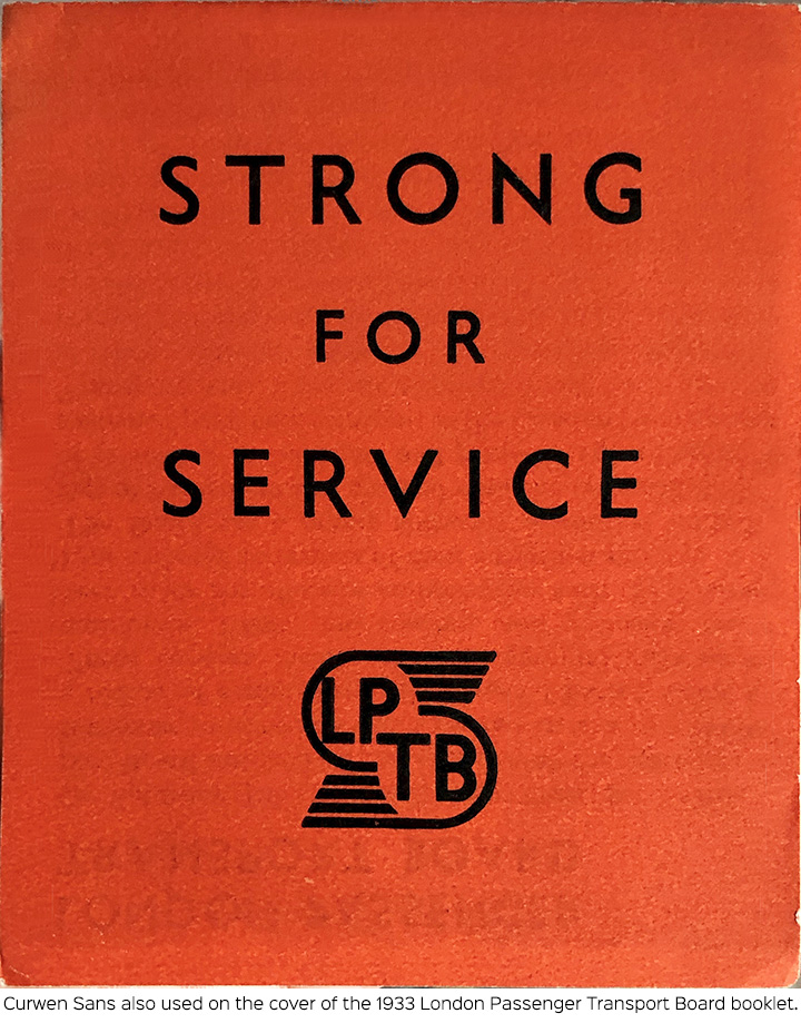
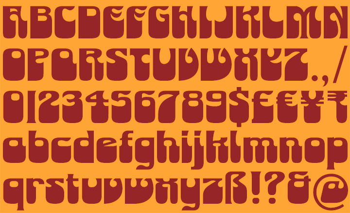
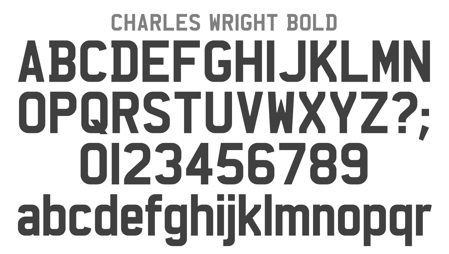
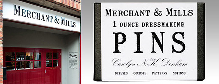
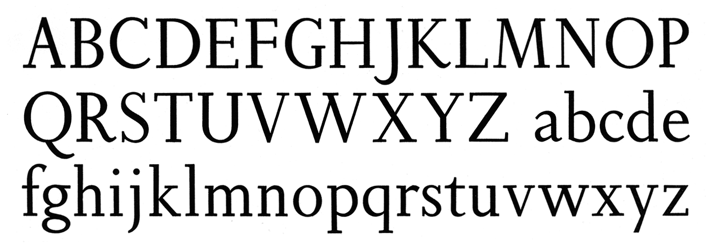
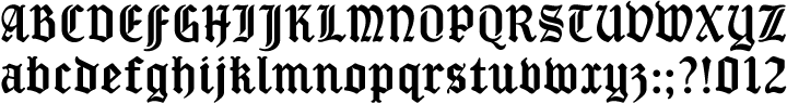
Curwen Sans is a monoline sans-serif dating from the early twentieth century. Though contemporary with Johnston’s Underground and Gill Sans, and emerging from the same artistic milieu, Curwen Sans was created solely for in-house use at the Curwen Press in London so never achieved a wide audience or recognition.

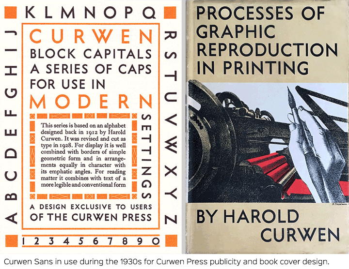
Harold Curwen studied lettering under Edward Johnston and Eric Gill at the Central School of Art and Crafts, and his typeface is described in Curwen Press publicity from the 1930s as a series “based on an alphabet designed back in 1912”. His capital letters are strikingly modern, geometric monolines that share features with both Johnston’s Underground of 1916 and Gill Sans of 1928. Curwen opted for an overlapping W which was also present in versions of Johnston’s Underground until the late 1930s. He preferred vertical terminals for his curved letters, even the uppercase S, which was a similarly consistent feature of Gill Sans. Although the drawing of Curwen’s capitals might predate the two design classics, Curwen Sans capitals and numerals were not cut in metal type until 1928, and only in a Medium weight.

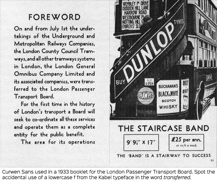
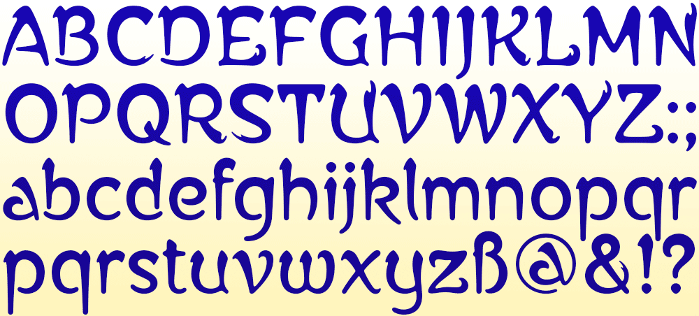
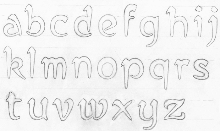
A lowercase with some uncomfortably congested characters was hastily added a few years later and owes much to Rudolf Koch’s Kabel of 1927 both in the design of some glyphs and in the very low x-height which was even smaller than another influence, Paul Renner’s Futura of 1927.

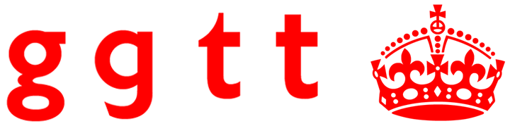
Curwen’s lowercase g derives from, and perhaps improves on, the idiosyncratic g of Kabel. His swan-necked lowercase s has a quirky yet elegant art deco slant that encourages words to glide along gracefully. His unclosed lowercase e is daringly different, possibly inspired by an experimental form Renner initially considered for Futura, and reminiscent of the ‘Village’ adaptation of Berthold Wolpe’s Albertus created for the 1960s TV series, The Prisoner.

Alterations and Alternates

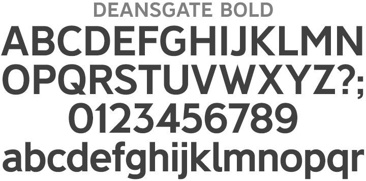
K-Type’s Curwen Sans lavishes the lowercase with some long-overdue TLC. To better suit contemporary design requirements, small letters are redrawn bigger and the stroke weight is made slightly thinner relative to the capitals. Crucially, the x-height is increased, following the example of more recent versions of Kabel, thus decreasing stroke congestion and allowing uncomfortably narrow letters to be widened to improve compatibility and evenness of colour; most notably, the larger a, c, e and g achieve better balance with other letters. Curwen’s top-heavy lowercase f is narrowed and benefits from a higher crossbar, as does the lowercase t.

The lowercase c has been altered to match the vertical terminals of Curwen’s uppercase C and also conform to the vertical endings on the e, a, s and S. The numerals 3, 5 and 7 are also given vertical terminals. These vertical terminals are similarly consistent in Gill Sans, whereas Johnson had considered and rejected them for his uppercase S even though his lowercase s featured vertical stroke endings. K-Type Curwen Sans makes vertical terminals the standard for new characters such the euro sign and even in the design of diacritical marks; like all recent K-Type releases, Curwen Sans now has a full repertoire of Latin Extended-A accented characters.

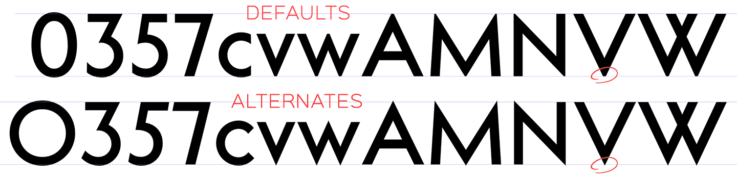
The original lettering may have been drawn with sharp pointed apices and vertices for the A, M, N, W, V, w and v, but printed samples show rounded corners that bestow a softness and warmth. So, like the heavier weights of spiky geometrics such as Kabel and Futura, K-Type Curwen Sans truncates such pointy overshoots to avoid evoking any ‘sat-on-a-pin’ discomfort.

Curwen’s original zero was identical to the uppercase O, but the K-Type Curwen Sans zero is narrowed to better match the width of other numerals.

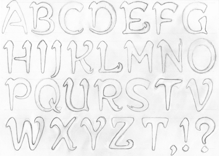
However, purists need not be alarmed by these changes; where characters have been altered, perhaps contentiously, versions more faithful to Curwen’s originals are included as alternates accessible within opentype savvy software. Alternates include the unaltered lowercase c, Curwen’s more skewed number 5, the 3 and 7 with angled terminals, the wider circular zero, and the A, M, N, W, V, w and v with pointed apex and vertex overshoots.

Curwen’s strict monolinearity has been very slightly relaxed in the digital face to introduce a small degree of stroke contrast, so horizontal strokes are made a little thinner than verticals, and a modest narrowing of strokes is introduced at congested intersections.

K-Type Curwen Sans comprises three packages:
• The Basic Family of Regular and Bold, complete with new optically corrected Oblique and Bold Oblique fonts.
• The original Medium weight with a new optically corrected Medium Oblique.
• A new Light weight with a new optically corrected Light Oblique.

Thanks to Birmingham designers An Endless Supply (Harry Blackett and Robin Kirkham) for their research into Curwen Sans and the Curwen Press in their publication, ‘Curwen Sans Type Specimen’. Also to Mikey Ashworth for his photographs of Curwen Sans samples, and to Andrew Emmerson for suggesting the revival.

——————————————-

Harry Carter – ‘SanSerif Types’ (1931)

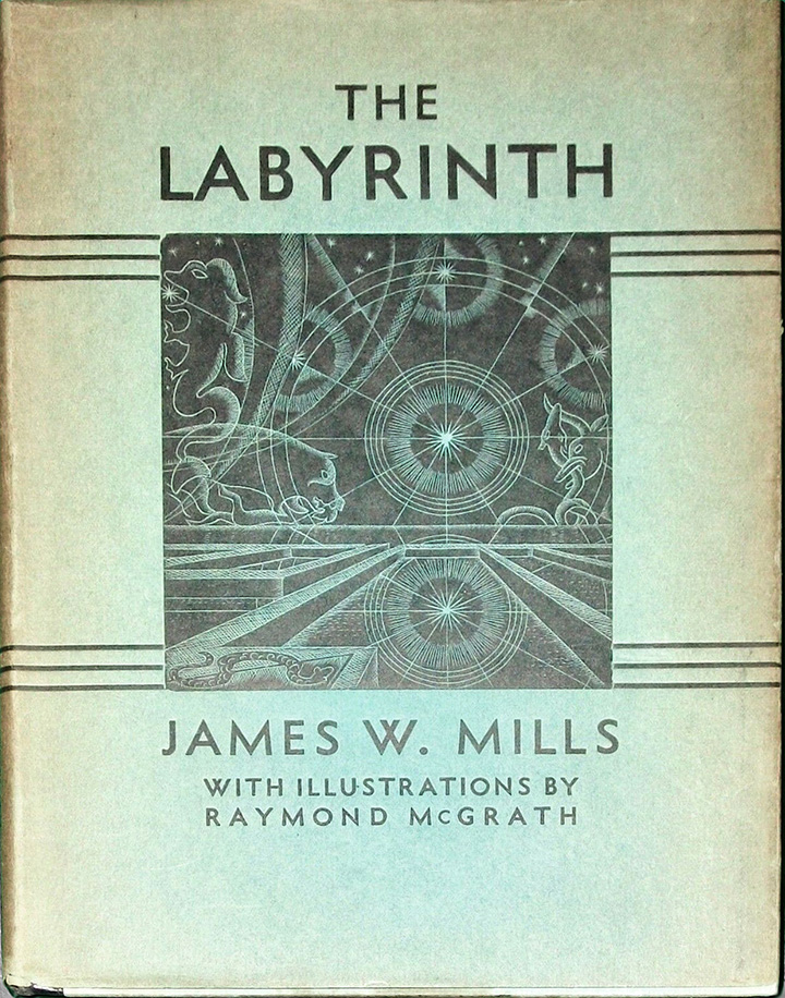
“Three very good sanserif types are now on the market (Futura, Kabel and Gill Sans – Ed). Had they been available thirty years ago Mr Harold Curwen might never have brought his block-type into being. With an origin quite independent of, and indeed earlier than other modern sanserifs, it was conceived at a time when Mr Curwen was studying lettering under Edward Johnston. It was quite natural that they should both solve the problem of a simplified roman letter in the same way, for both took the Trajan Column as a model of good lettering. The ‘Curwen’ block capitals were first used for a letter-heading in 1912. They were the result of following the best Roman models with a big round-pointed lettering nib. Soon afterwards, when Messrs Crittall were seeking a distinctive letter for their publicity, they found what they wanted in these capitals that Mr Curwen had drawn. For several years they were printed from line-blocks, but after a while reasons of economy prompted their being made into type. Messrs Bannerman, of Wood Green, engraved the matrices. Recently Mr Curwen has drawn a lower-case and has had one fount made, in 24-point.

“The Curwen Sans is bold in colour and the strokes are of precisely equal thickness throughout. It is unconventional in several respects, and even open to criticisms from a purist in type-design. Yet it has great vigour and charm and is suitable for long-range display, especially of an open character.”

——————————————-

——————————————-


Kaleidoscope Eyes

To celebrate the fiftieth anniversary of the Beatles’ Sgt Pepper LP, the BBC broadcast Sgt Pepper’s Musical Revolution, in which composer Howard Goodall explains why the album is still considered innovative, even after half a century.

The title, captions and credits for the show made full use of the three K-Type Sgt Peppers fonts which were based on the original bass drum capitals painted by fairground artist, Joe Ephgrave. Two of the fonts, Sgt Peppers Outline and Sgt Peppers Outline Fill, are all capitals with matching spacing and kerning that can be overlapped for bicolor effects and for creating lookalike drums. The Sgt Peppers Lonely Hearts Club font includes a newly designed lowercase and European accented characters.

Five Go Adventuring

Bruno Vincent’s series of spoofs featuring Enid Blyton’s Famous Five characters continues to proliferate, and K-Type Adventuring was the logical choice of font, being based on the cover capitals from the classic 1950s and 1960s books.

And the reverse of each book puts Adventuring’s newly designed lowercase to good use for a witty pull quote.

Timmy was neutral

A Moon Shaped Font

K-Type Deansgate was chosen as the typeface for Radiohead’s 2016 album, A Moon Shaped Pool. The fonts can be seen in action on cd covers, vinyl sleeves, booklets, and publicity material.

The two Deansgate families, a normal width and a condensed, are based on mid-twentieth century lettering from Manchester street nameplates. A new Light weight was created specially for use by Radiohead designer Stanley Donwood, and light weights have since been added to both Deansgate families available from K-Type.

Who was Charles Wright?

It is surprisingly difficult to find information about the origin of the fonts used for vehicle number plates in Britain. In recent years, the style of typeface has been ambiguously described by UK government agencies as ‘prescribed’, ‘mandatory’ or ’standard’, and it is the general public who have preserved its birth name and a clue to its heritage, largely by word of mouth. The older, wider version of the typeface is still referred to as Charles Wright 1935, giving a clear and most probably accurate indication of its inception. Some have assumed that the typeface was named after the original designer, but it’s actually the name of the company that developed it for die stamping vehicle plates.

According To Yasmin Webb at Barnet Local Studies and Archives, Charles Wright senior was born in London in 1842 and founded his sheet metal pressing plant in 1867 at Clerkenwell, initially making Crimean war medals, and later producing seals, dies and embossing presses. He set up home in Mill Hill, married in 1870 and had twin girls, Annie and Christina born in 1870, and a son also called Charles born in 1874.

Business flourished, and when the factory proved too noisy for an inner city location in 1900, Charles Wright Ltd moved to new premises at Thorn Bank, Edgware. By the 1920s the company was also known as Wright & Son, Charles junior having evidently joined the family business, and was producing huge numbers of medals for soldiers from World War 1, an article from The Record News on 19th June 1923 boasts an output of 35,000 medals a day.

The-Record-News-19-June-1923

By 1935, the Wright company would have been a logical choice for pressing vehicle number plates and presumably the lettering would have been created in consultation with the Ministry of Transport. It’s unlikely that Charles junior himself would have designed the idiosyncratic sans serif, but perhaps the design work was assigned to a company draughtsman at a time when drawing office jobs accorded little prestige and individual innovations went uncredited. However, since the business was wound up in the early 1970s, it’s doubtful we’ll ever know who masterminded the company’s legacy, the typeface that still bears its name.

The current lettering is sometimes referred to as Charles Wright 2001. At the turn of the century, the numbers and letters were condensed from 57mm wide to 50mm in order to make room for an additional character and an optional European symbol / GB legend. The 2001 style became compulsory and a growing trade in fancy, often illegible, registration plates was eliminated.

The most common form of the face does have its critics, not least because the condensed version reduced counterspace and resulted in some uncomfortably tight angles. The website leewardpro.com, which contains fascinating information about license plates throughout the world, notes, “the previous sharper central vertexes of M and W were truncated, making them flat. This change combined with the more condensed widths of the new M and W have ended up making the angled strokes forming their central vertexes more difficult to distinguish from a distance”.

The Leeward site also notes, “the ‘mandatory’ use of this font is a bit more flexible than it sounds. What is actually mandatory are the character height and width, stroke width, and spacing between characters. Exact adherence to the letter shapes themselves is not required as long as the basic shape of each letterform as depicted in the Charles Wright font is followed”. Indeed, close observation of UK vehicle number plates will reveal slightly different letter shapes, all following the basic style and complying with sizing guidelines, but testifying to the use of different fonts by platemakers.

Charles Wright Bold

Enter K-Type Charles Wright, a carefully drawn version of the style that improves legibility, most notably with regard to the muddy middles of M and W, and with myriad modest typographical adjustments that not only make number plates look better but also produce a typeface that is acceptable for design work. Curved terminals are a little less obvious and rounded shapes are not quite as square as older versions. A hint of stroke contrast has been introduced with horizontals being very slightly thinner than verticals.

The K-Type Charles Wright typeface is supplied in three weights – Bold, Medium and Regular – and an Oblique for each weight is also provided. The fonts are conscientiously kerned for designers. The uppercase of the Bold font conforms to British registration plate specifications. A newly created lowercase, the additional weights, and a full compliment of European accented characters enable the typeface to be used more comprehensively and imaginatively.

For vehicle platemakers, three additional fonts are included which only contain uppercase letters, numerals and basic punctuation, and which are not kerned. A slightly lighter Charles Wright Motorcycle conforms to the British specifications for motorcycle plates, Charles Wright Bold Caps only contains unkerned uppercase letters, numerals and basic punctuation for standard plates, and Charles Wright 1935 is a version of the original, wider uppercase and numerals still used on plates for older vehicles.

UK Plate Specifications

Deansgate – Manchester Modern

The Deansgate fonts were prompted by some distinctive capital letters used on Manchester street nameplates, a mid-twentieth century style distinguished by a pointy Z, and pointed vertex/apex on the M and W.

Deansgate

The nameplates are made by Greens/GB Signs at their factory in Wythenshawe using 3 inch dies that were purchased some years ago from a manufacturer who had ceased trading. Sarah Farrell from Greens explains that the identity of that firm “is lost in the mists of time. We’ve had the dies for so long that we just refer to them as ‘the 3 inch MOT ones’ or ‘old car plate dies’. I think they are based on the old Charles Wright font from 1935, but I’m not 100% sure about that.”

Curiously, the street nameplate lettering bears little resemblance to the typeface used for car number plates and commonly referred to as the Charles Wright font. However, Charles’s London-based company of Wright & Son undertook many kinds of metal stamping work, initially making medals and later producing seals and embossing presses, before manufacturing vehicle registration plates and creating the style of lettering still used on vehicles today (see the Kernel article on Charles Wright).

In the early 1930s, the Ministry of Transport with assistance from the British Institute of Industrial Art devised an MoT alphabet to help improve and standardise street nameplates. Wright & Son would have been an ideal choice of manufacturer, and when the company closed down in 1972, some of its dies and pressing equipment could well have migrated up to Manchester.

Whatever its origins, Deansgate has an open, welcoming character and is quite British in a Keep Calm, Johnston’s Underground kind of way. It looks less corporate than the older News Gothic Bold that’s also used for Manchester street nameplates, while still possessing the the legible, slightly ’squarified’ round shapes associated with grotesque faces. As well as having the distinctive pointed Z, M and W, Deansgate’s G and K are less congested, and it’s more monolinear, like the Transport typeface, ideal for clear, readable signage. The typeface is available in two widths, Deansgate (normal width) and Deansgate Condensed, and each family includes Regular and Light weights in addition to the signage Bold, each weight being accompanied by a complementary Italic.

Deansgate Bold

Motorway – Sixty Years later

It’s always a delight to come across familiar lettering that has never been made into a proper typeface, and if you’ve driven along a British motorway you’ll be very familiar with the numbers and letters of the Motorway alphabet, partially designed back in the late 1950s but never completed. Until now.

Motorway
Motorway is the companion typeface to Transport, the British road sign lettering. The Motorway alphabet was created for the route numbers on motorway signage, and is taller and narrower than the accompanying place names and distances which are printed in Transport.

However, for Motorway Jock Kinneir and Margaret Calvert created only the numbers 0 to 9, the capitals A, B, E, M, N, S and W, ampersand, slash, parentheses and a comma. So, although the lettering made its first appearance on the Preston bypass in 1958, K-Type Motorway is the first complete typeface and contains all upper and lower case letters, plus a full complement of numerals, punctuation, symbols and Latin Extended-A accented characters.

As with the Transport alphabet the starting point was Akzidenz Grotesk, Motorway taking inspiration from condensed versions. Changes were mainly driven by a quest for legibility, resulting in some reduced contrast between horizontal and vertical strokes, and Gill-esque straight diagonal limbs on the 6 and 9, and high vertex for the M.

Kinneir and Calvert designed the limited range of characters in two weights; a SemiBold ‘Permanent’ weight for use as white letters on blue motorway signs, and a Bold ‘Temporary’ weight for heavier black letters on yellow non-permanent signage.

In addition to creating full fonts in both original weights, the K-Type family adds a new Regular weight, plus a set of italics, completing a highly usable condensed typeface which, while rooted in history, is fully functional for both print and web usage. The K-Type fonts are spaced and kerned normally, simply increase the tracking to recapture the generous spacing of motorway signage.

The download includes all six fonts; the three weights – Regular, SemiBold (Permanent) and Bold (Temporary) – each with a corresponding italic. The Motorway typeface is the perfect partner to K-Type’s Transport New.

Transport New

Transport New is K-Type’s redrawing of the typeface created for British road signs. It includes not only the familiar Heavy and Medium weights, but also the previously unreleased Light weight font envisaged for back-lit signage but never actually applied.

Transport New

Originally designed by Jock Kinneir and Margaret Calvert beginning in 1957 and first published on the Preston bypass in 1958, the starting point for the typeface was Akzidenz Grotesk, a prototype for neo-grotesques which also provided a model for Helvetica and Univers. Jock Kinneir wasn’t initially asked to design a special typeface, but he and Margaret Calvert didn’t consider the German face to be wholly suitable and so developed their own letterforms with reduced stroke contrast. They also introduced some features borrowed from Johnston’s Underground type – the curled foot of the lowercase L and the high, pointed middle of the uppercase M for instance. Designed to eliminate confusion between characters and increase legibility, they also help to give Transport a British flavour.

The Transport face has subtle eccentricities which add to its distinctiveness, and drawing the New version involved walking a tightrope between impertinently eliminating awkwardness and maintaining idiosyncrasy. Transport New wouldn’t be the first typeface to have overstepped the mark and gone bland.

So, K-Type’s version, first released in 2008, includes cheeky but delicate refinements – shortening the uncomfortably close terminals of characters such as 5, 6, C, G, and e, giving the S and s a more upright aspect and tucking in their protruding lower terminals, narrowing overly wide glyphs like the number 4, and slightly opening up some claustrophobic counters. The question mark is redesigned, and parentheses have been given some stroke contrast. The x height is edged fractionally even taller.

The Heavy font is actually more of a Bold, and the Light is pretty much a regular weight, but the original nomenclature has been retained for old times’ sake.

Version 3.0 of Transport New features significant improvements including numerous outline and spacing refinements, and a full complement of Latin Extended-A characters. Also, to align Transport New with the 2015 release of Motorway, the other typeface used for UK road signage, italic fonts for all three weights have been added.

The Sgt Pepper Fonts

K-Type’s Sgt Peppers Lonely Hearts Club typeface, three fonts inspired by the bass drum lettering within the legendary album cover, has a fascinating backstory.

In 1967, the art dealer Robert Fraser suggested to Paul McCartney that the Beatles might commission a fine artist to design the artwork for their forthcoming album, Sgt Pepper’s Lonely Hearts Club Band.  Pop artists Peter Blake and Jann Haworth were chosen for the project and Haworth had the idea of displaying the album name on a bass drum,

“The drum, by the way, was part of my thoughts to avoid the dreaded imposition of lettering by a graphic designer. Joe Ephgrave was a fairground painter that I had commissioned to do a number of pieces previously, and he did the drum in the ‘futuristic’ style that was his signature. I still have one of his drawings.”

Joe Ephgrave

Ephgrave was asked to submit two alternative painted drum skins for possible use in front of the life-size group of heroes photographed for the album cover. The two paintings were done in March 1967 and the preferred design with Ephgrave’s art deco lettering throughout was chosen for use on the LP sleeve.

Sgt Pepper sleeve-drum1

Ephgrave’s other design featured spur serif lettering and was attached to the reverse of the bass drum. This alternative was also photographed and has since been used for the sleeve of a bootleg album.

Sgt Pepper sleeve-drum2

K-Type’s Sgt Pepper fonts are based on Ephgrave’s ‘futuristic’ art deco style. The Sgt Peppers Lonely Hearts Club font completes the uppercase, adds a lowercase, and includes a full complement of over 400 characters.

The licensed typeface also includes two other fonts, Sgt Peppers Outline and Sgt Peppers Outline Fill, designed to be overlapped for creating bicolor/multicolor effects and faux drums. The Outline and Outline Fill fonts do not contain lowercase characters, instead they comprise two weights of capitals as painted on the Sgt Pepper drum. The uppercase letters are in the wider style from around the outer edge of the drum, and the lowercase keys deliver the more condensed ‘Lonely Hearts’ inline style from the middle of the drum.

The uppercase Y has been flipped to produce a more conventionally acceptable character with the thicker diagonal arm on the left. However, Joe Ephgrave’s reverse Y (with inline) is included in the Outline fonts at the Section keystroke § (Alt-0167 on Windows).

K-Types Set Loose

When Merchant & Mills, the English drapers’ supplier, needed a font with a rustic and homely, down-to-earth feel for their products, they turned to K-Type’s recently enlarged Mailart Rubberstamp family to provide just the right sense of traditional, hand-crafted reliability for their delightfully simple, no-nonsense packaging.

Mailart Rubberstamp - Merchant & Mills

Also making extensive use of Mailart Rubberstamp’s old-school aura is clothing retailer Fat Face, who testify to the font’s versatility from huge shop window displays right down to individual garment labels.

Mailart Rubberstamp - FatFace

UK based Indian food manufacturer, Patak’s, is also keen on K-Type. The company uses Mailart Rubberstamp in its advertising, and K-Type Norton adds the perfect portion of ‘exotic’ to the labels of its sauces and spices.

Norton - Pataks

Another K-Type font, Ray Johnson, provides the friendly and informal face of Oloves, snack packs of tastily flavoured olives.

Oloves

Enamela – Lost Lettering?

In November 2012 I received an email from Richard Jones in Welshpool suggesting that K-Type create a typeface based on a condensed sans serif he’d observed on old enamel signs. Richard attached this clear photo of one such sign showing particularly intriguing diagonal terminals on the J and S.

Welshpool Sign

Richard and I embarked on an impromptu campaign of research, discovering that the lettering had been widely used for street signs, Post Office signs, the plates on James Ludlow wall postboxes, railway signs, direction signs and circular Automobile Association wayfinding plaques, with common usage continuing into the 1950s. A rare example of the lowercase was found on a Webbs Seeds enamel.

The origin of the lettering dates from the Victorian era. A hand drawn cover design of the Bishop’s Castle Railway dating from 1864 shows how rounded letters are transformed by squashing and squaring off block letters. The 1888 catalogue of the Chromographic Enamel Company of Wolverhampton displays an outline version the style.


A Cherry Blossom Boot Polish enamel advertising sign on the Advertising Antiques website is estimated to date from 1880. Between 1908 and 1915 the lettering was used on ‘bull’s eye’ station signs for London Underground prior to the introduction of Johnston’s Underground type.

Cherry Blossom & Westminster Signs

The quirky terminals stemming from the compression of geometric type invite comparison with the Charles Wright vehicle registration plate font. Alistair Hall of the London design company ‘We Made This’ also went On the trail of the angled terminal and identified Venus Extra Bold Condensed from the German Bauer Foundry around 1916 as a fairly close match with the same sloping terminals. A decorative serif face called Runic with similarly angled terminals was released by Monotype in 1935. Alan Brignull notes the resemblance to a Victorian wood type, also called Runic, with the terminals of rounded letters sloping in the opposite direction.

Whilst the style endured on vitreous enamel signage for many decades, a degree of variation can be observed between different examples, with draughtsmen evidently feeling free to amend the basic letter shapes and exercise individual taste. The lettering sometimes has a hand-crafted quality that suggests the cutting of stencils or templates, perhaps based on a specification sheet.

Signs

The middle diagonals of the uppercase M usually extended down to the baseline, becoming rather heavy and congested, but some draughtsmen, as with Richard’s ‘Sand Pit’ sign, started following the Gill /Johnston example of a high-centred ‘Florentine’ M, and this more elegant option has been chosen for the new Enamela typeface, though the alternative M with lower vertex is also provided at the Alt-M (µ) keystroke on a Mac, or Alt-0181 on Windows. While some designers preferred a plain vertical throat on the G, others added a crosspiece to help distinguish it from a C, and the latter is the form chosen for the Enamela fonts. However, the G without the horizontal is also present, assigned Unicode FF27 (full width capital G).

In search of an existing digital font, I sought the help of Luc Devroye in Montreal who identified the closest match as Czech designer František Storm’s Enamelplate D, similarly condensed with the correctly sloping terminals. However, many characters differ substantially from those in local source material, indicating that continental European enamel lettering varied from its British counterpart.

K-Type Enamela is offered in normal width and condensed versions, with a choice of bold, medium and regular weights, each accompanied by a free italic (oblique). The typeface isn’t simply a re-creation, which would hardly be possible since there are so many slight variations, it’s a family based on the best examples found, and which has been updated where appropriate, augmented to suit contemporary needs.

Non Solus – Update 2012

This post is an adjunct to The Non Solus Story written in 2005, a year after the project to recreate Eric Gill’s Solus typeface began.

Non Solus, K-Type’s version of Eric Gill’s long neglected ‘light Egyptian’, was overhauled and improved in 2012 using a clearer sample kindly sent to me by Simon Gooch, an even higher resolution image of the 48pt uppercase and lowercase letters from the January 1948 issue of ‘Alphabet and Image’.

Solus

In response to the new sample I decided to slightly reduce the weight of the Regular weight and made many outline, spacing and kerning refinements, and added more Western European accented characters. The new release also added three new weights, Light, Medium and Bold, and all weights are accompanied by free Italics that are only gently inclined and which, in keeping with other Gill faces, are noticeably condensed.

Non Solus still includes the warm, subtle bracketing of serifs which is clearly visible in printed sources. The bracketing of slab serifs is unusual but not unheard of, as Clarendon confirms, but I still wonder if brackets featured in Gill’s original drawings.

Although the original Solus included the Bold weight, the only sample I could find was a very poor, degraded photocopy image. In Autumn 2011 when planning the update, I again emailed Robin Nicholas at Monotype for any help he might provide, hoping for some clearer images of the Bold weight. Sadly I received no reply, but I nevertheless decided to create a heavier weight albeit based on a poor copy of Solus Bold in conjunction with studies into the differences between the Regular and Bold in two of Gill’s other typefaces, Joanna and Perpetua.

Monotype’s Solus Bold doesn’t appear to be very sensitively cut and, at least on my admittedly dubious samples, seems too close in weight to the Regular. K-Type Non Solus adds a little weight to the Bold which now appears both powerful and elegant, redolent of 1940s black & white film titles.

New Medium and Light weights have also been added to the family, and the development of the Italics that accompany each weight has resulted from the close observation of Gill’s other faces and a degree of extrapolation.

Although I like the ‘Non Solus’ moniker of the K-Type version, I also asked Robin Nicholas if I might use the proper name of the typeface, “I would like to make the new version accurately Solus and using its rightful name would seem both desirable and more honorable to Gill’s memory. The Solus trademark hasn’t been actively defended for 45 years and it is now 83 years since the face was designed”. In the absence of a reply, K-Type’s recreation will continue to be called Non Solus.

Non Solus - alternate M

Gill’s alternative M is located at the μ key (Alt M on a Mac, Alt-0181 on a PC).

Keep Calm and Carry On

Keep Calm is a family of fonts developed from the now famous World War 2 poster that was designed in 1939 but never issued, then rediscovered in 2000. As well as the original Keep Calm font, the medium weight of the poster, new weights are now available – Keep Calm Book (regular weight), Heavy and Light – and each weight comes with a complimentary italic.

Version 2.0 (2017) is a comprehensive update which consists of numerous refinements and improvements across all weights. The family now contains a full complement of Latin Extended-A characters, Welsh diacritics and Irish dotted consonants. The four italics have been optically corrected with revised, ‘true italic’ forms of a and f.

Keep Calm

When I first saw the Keep Calm and Carry On poster, I wrongly assumed the letters to be Gill Sans. Recent research at the National Archive by Dr. Bex Lewis of Manchester Metropolitan University has revealed that the original poster was hand drawn by the illustrator and painter, Ernest Wallcousins. The Gill Sans influence is apparent, in the R particularly, the M’s perfectly pointed vertex is redolent of Johnston’s Underground, and the most anomalous character, the C, resembles the ‘basic lettering’ of engineers that provided the vernacular sources for the Gotham typeface.

Developing the Keep Calm typeface has been an exercise in extrapolation; an intriguing challenge to build a whole, high quality font family based on the twelve available capitals of the Keep Calm poster, and on similar lettering from the other two posters in the original series. This has required the creation of new lowercase letters that are believably 1939; that maintain the influence of Gill and Johnston while also hinting at the functional imperative of a wartime drawing office. Wallcousins’s lettering balanced intuitive human qualities and the pure pleasure of drawing elegant contemporary characters, against an underlying geometry of ruled lines, perfect circles, 45° terminals, and a requirement for no-nonsense clarity.

The lowercase g follows the Gill / Johnston eyeglass model, but also included is an alternative, single-storey g at the Alt-G keystroke (Alt-0169 on Windows) normally used for the copyright symbol, which has been relocated elsewhere in the fonts.

An alternative lowercase t, without the curved wedge cutaway, is provided at the Alt-T (dagger) keystroke (Alt-0134 on Windows).

Keep Calm

The crown motif from the top of the Keep Calm poster is located at the plus minus ± and section § keystrokes (Alt 0177 and Alt 0167 on Windows).

Fontology

‘Fontology’ by Maia Francisco, has been released by European publisher Promopress, and includes eight K-Type fonts: Designer Block, FlatPack, Insecurity, Kato, Klee Capscript, Mailart, Roadway and Sans Culottes. As well as being an attractive coffee table book, it contains a useful cd of over 100 fonts that are ‘free for personal use’.

Fontology

Elsewhere, K-Type Magical Mystery Tour makes a guest appearance in Simon Garfield’s ‘Just My Type’, and our Victor Moscoso font is featured in Gregor Stawinski’s ‘Retro Fonts’.

Mandatory in Brazil

K-Type Mandatory has been chosen for Brazilian vehicle plates from 2012 until the introduction of the Mercosur standard in 2018.

Brazil Vehicle Plates
Mandatory, and the more comprehensive Charles Wright fonts, are based on the lettering used for British plates since the 1930s and which became compulsory in the UK from 2001.

K-Type at the Movies

Lindy Heymann’s movie ‘Kicks’ received wide critical acclaim and K-Type Roadway is the director’s choice of font for the title, credits and publicity captions. The film is the story of two teenage girls in Liverpool who share an adoration for a local footballer. When a transfer to Real Madrid is announced, the girls take drastic action to prevent him leaving.

Kicks

New Old English

Designing fonts feels like playing about at a sub-atomic level in some kind of typographical microverse, a godlike noodling with the stuff of creation. Particularly so with New Old English where I would be tampering with tiny particles of history and quite possibly treading on the toes of time. I was aware of impertinently tinkering with things that might best be left untinkered, yet the direct source for my font was not an original blackletter from the Middle Ages, but a mere 150 year old example of Victorian Medievalism where the tampering had already begun.

New Old English was prompted by two Victorian coins, the mid nineteenth century gothic crown and gothic florin, which featured a gothic script lowercase with quite modern looking, short ascenders and descenders enabling it to fit snugly around the queen’s head or heraldic motif.

Victorian Gothic Coins

The hairline strokes seemed thicker than normal for Old English typefaces, maybe engraved so to prevent thinner lines from wearing away quickly in circulation. The die-struck lettering had a malleable, less sharp, warmer feel than lettering scripted with a pen. The dots of colons on the coins were rounded rather than the usual rhombic, perhaps again demonstrating the influence of engraving rather than drawing with a pen. So, New Old English initially became an attempt to capture the round-cornered softness of the minted lowercase blackletter.

I love the economy and elegance of gothic script lowercase letters, but the uppercase letters often seem too wide and too decorative for a modern sensibility. I could imagine the designer of the gothic crown engraving the lowercase tightly and delightfully around the coin’s circumference, but grimacing at the incongruously fancy capital V required for ‘Victoria’. I was once advised to use the stylistically simpler, though still too wide, Lombardic capitals with my gothic script lettering, an imperfect solution at best.

For New Old English I wanted to create a narrower uppercase that would increase harmony and homogeneity between the cases. So, the uppercase is more condensed than is customary, it has the height and presence of a capital without the excessive width or antiquated flamboyance of the traditional blackletter. It might even allow text set in capitals to look acceptable.

New Old English

Roadway to the Future of Web Design

Designer Mike Kus delivered an inspirational presentation at this year’s FOWD conference in London, and his much-praised slideshow made great use of K-Type’s Roadway font based on the typeface used for New York street signage.

Mike Kus

K-Type on The Daily Show

The Daily ShowK-Type Norton is the choice of typeface for “Old Man Stewart” on the current series of top US satire, The Daily Show. The font which is based on the four characters in the old Norton motorcycles logo, has been updated for contemporary use and expanded to include a lower case and our usual full complement of accented characters.

Blue Plaque at Tate Liverpool

Artist Nina Edge chose to use K-Type Blue Plaque for her ‘5 Dimensional Everything’ art game at the Liverpool Tate Gallery. Her piece was part of the ‘Ideas Taking Space’ exhibition which featured a dozen artists and was shown from September 2008 to February 2009.

5 Dimensional

Norton at Glastonbury

Artist Stanley Donwood sent us his 2008 Glastonbury T-Shirt design which uses our Norton font. If you haven’t visited Stanley’s entrancing website, Slowly Downward, you’ll also find a little touch of K-Type Blue Plaque there too.

Glastonbury

Summer of Love

Bigfoot

2005 was a Summer of Love in the sunny North West of England, give or take a few rainy fortnights. After having bought a copy of Gastaut and Criqui’s book ‘Off the Wall – Psychedelic Rock Posters from San Francisco’, we went to the Liverpool Tate Gallery and saw their Summer of Love exhibition. The best part was right at the start, a big room filled with those magical hippie posters by Rick Griffin, Wes Wilson, my favourite Victor Moscoso, and others, not forgetting the marvellous Martin Sharp, the Australian artist who lived here in England in the sixties.

Apart from being stunned by the amazing colours of the original posters, I’d already begun to look closely at Victor Moscoso’s letterforms and start work on a font inspired by the hugely exaggerated slab serifs on posters like his ‘Horns of Plenty’ featuring Quicksilver Messenger Service and Big Brother & the Holding Company. And so K-Type Bigfoot was born, Moscoso-inspired but with a completely new set of lower case letters that were pretty tricky to keep in character.

Then came a beautifully blobby Victor Moscoso font based on the artist’s Moby Grape ‘Neptune’s Notion’ alphabet that has its origins in nineteenth century wood type, the Magical Mystery Tour fonts, and fonts inspired by the lettering of Rick Griffin which feature a new lowercase characters that sit just right. Also, a Wes Wilson font based on the letterforms of the Austrian Secessionist, Alfred Roller.

Lexie Readable

Lexie Readable

Vincent Connare’s Comic Sans arouses great passions. In schools here in England it is held up as the font that children find easiest to read, it is a ubiquitous success story, and its inappropriate use has tormented many a typographer. We confronted our fear and looked into the mouth of the lion. Lexie Readable (formerly Lexia Readable) is a family of fonts designed for maximum legibility, it’s an attempt to capture the clarity and accessibility of Comic Sans without the American comic book associations and whimsical childlike quality which are culturally inappropriate for many uses and may seem patronizing.

Lexie is an attempt to retain the strength, friendliness and legibility of Comic Sans, and even a slightly marker-drawn feel, whilst tidying up the comic book idiosyncrasies. It adds a hint of dignity, a sprinkling of refinement, and introduces elements of designer type to appeal to a contemporary audience.

While Comic Sans has long been a preferred choice for infant typography from ‘Baby on Board’ stickers onward, its use risks undermining any serious message and appearing condescending to readers with greater visual maturity, issues that are particularly acute when applied to adolescent and adult literacy.

Typographical concerns from recent educational publications and discussions, and some highlighted by the British Dyslexia Association have been incorporated into the design of Lexie Readable – the simpler, handwritten forms of a and g, the non-symmetry of letters such as b and d, good sized descenders and ascenders, generous spacing and excellent screen clarity.

Dyslexia.com offer the font from their website, Abigail Marshall commenting,
“I am not utterly convinced that Lexie is superior to ComicSans (my personal favorite), which is also available to our users — but I do have to note that as soon as I converted our site to the Lexie Readable view, I immediately spotted a typographical error on the page that had previously eluded me.
 Lexie has been accepted for inclusion in the site customization feature of the Dyslexia.com web site.”

When information about the typeface was posted on the Typophile Forums, Vincent Connare, suggested a better name might be ‘Our Kid’, maybe ‘Comic Sons’, I suggested. Vincent mentioned that Dalton Maag already had a typeface called Lexia and I’ve recently been persuaded to do the honourable thing and change Readable’s name to Lexie.

The Non Solus Story

In 2003, whilst researching the life and work of Eric Gill, I came across several references to a typeface called ‘Solus’ cut in 1929. My curiosity was kindled when I experienced difficulty in finding an illustration of Solus in print or on the internet, and I discovered that the typeface had been withdrawn by Monotype in 1967.

Solus

A few meagre visual snippets failed to satisfy and in July 2004 I posted an internet request on the Typophile Forum. To my excitement Alessandro Segalini put up a copy of the Solus typeface from a specimen book, and although it was rather poorly printed at a small point size, I made a ‘Solus Rough’ font to get a feel for the typeface. I liked result and decided to research further, to seek out clearer source material and attempt the first digital version of Solus. I contacted Agfa Monotype by letter and email but got no reply.

I also made contact with some of the professionals suggested by Alessandro Segalini. Petra Cerne Oven asked Christopher Burke who felt that Solus was superseded by Joanna. James Mosley agreed, but still felt the resurrection of Solus to be an interesting project. I started to compare Solus with Joanna and found it to be more similar to Perpetua in many respects. I also still felt it to have an identity of its own, for me it has a real English schooldays feel.

Justin Howes of the Type Museum, who sadly died early in 2005, noted, “I’ve always liked Solus, and it would be good to see it revived”. Mailartist and printer Alan Brignull sent me a high resolution copy of some Solus characters printed at 48 pt. and I set to work on making a version that was as close to Gill’s original as I could create.

A big problem was the actual shape of the slab serifs. Even at 48 pt. the serifs appear to have slight curved bracketing. I acknowledge that this may well be an error – James Mosley wrote “My impression is that your bracketing, however sutble, is wrong, because Solus is conceived as essentially a mechanistic type — a ‘light Egyptian’.” Even so, I have decided to allow myself to be guided by my observations. Some Egyptians do possess curved brackets, moreover Solus has a warmth compared to Joanna that is augmented by the subtle bracketing visible on the printed copy.

In September, I contacted Robin Nicholas, Head of Typography at Agfa Monotype, and although he didn’t invite me round for a coffee and a detailed look at Gill’s original drawings, he did recommend Gill’s 1926 sketchbook, ‘A Book of Alphabets for Douglas Cleverdon’, as showing the origin of Solus, and I immediately ordered a copy from Amazon. He also noted, ” I understand that there may be a legal problem using the name ‘Solus’.”

Hence Non Solus is born. A typeface which is as near to the spirit of Eric Gill’s Solus as I have been able to make.

See also: Non Solus – Update 2012