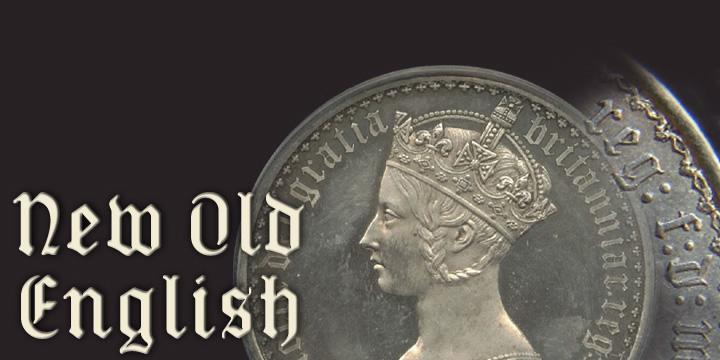
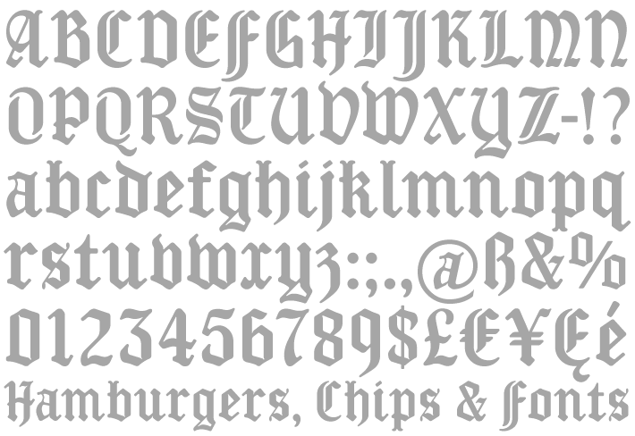
New Old English
New Old English was inspired by two Victorian coins, the gothic crown and gothic florin, which featured a gothic script lowercase with quite modern-looking, short ascenders and descenders fitting snugly around the queen’s head or heraldic motif. The font is an attempt to capture the round-cornered softness of the die-struck lowercase blackletter on the coins. There are thicker hairline strokes than on normal Old English, a less sharp, warmer feel than lettering scripted with a pen, and circular instead of rhombic punctuation. To increase harmony and homogeneity between the cases, the uppercase is narrower and simpler than is customary, without the excessive width or antiquated flamboyance of the traditional blackletter. You can read the full story behind this font in the Kernel.