An interview from the Identifont Blog, reproduced with permission
Alphonse Mucha is a decorative font with an Art Nouveau look about it. What inspired you to design it?
The font is based on lettering by the Czech artist Alphonse Mucha for a 1913 concert poster for the cellist Zdeňka Černý. Zdeňka Černý was an American virtuoso cellist, the daughter of a friend of Mucha. The poster was designed to publicise a European tour to begin in 1914 which had to be cancelled due to the war to end all wars.
I’ve loved Mucha’s work since the late 1960s. For my generation, the resurgence of interest in Art Nouveau, of Mucha and Aubrey Beardsley particularly, was part of the countercultural vibe at the time. Several K-Type fonts spring from similar early enthusiasms, and what fascinates you in your youth tends to stay with you.
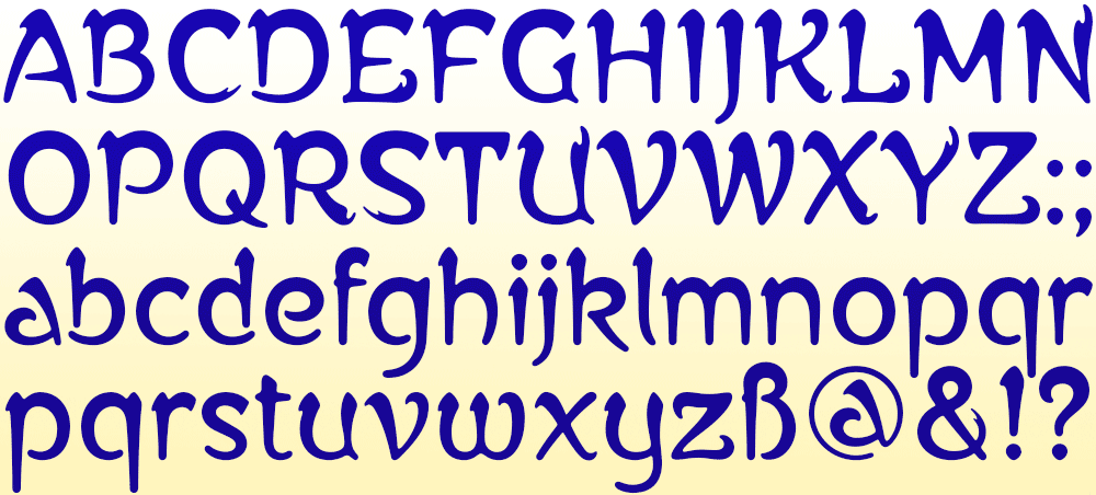
You’ve written that Alphonse Mucha was developed from the nine letters in a concert poster by the Czech artist Alphonse Mucha for the cellist Zdeňka Černý. That leaves 43 upper and lower-case letters to design, not to mention the digits and punctuation! How do you set about doing this?
The main inspiration was the Černý poster with its distinctive top-heavy letterforms. Top-heavy could easily spawn awkward and unwieldy, so the mission was to design letters and numbers that maintained the grace and uniformity of those nine capitals, to create an elegant evenness of type colour throughout.
I looked closely through Mucha’s poster work for letterforms that were somewhat compatible, though for most characters I just accessed my inner Mucha and designed from scratch. I really enjoy the task of making a whole character set from the starting point of a few letters, just as the Keep Calm font developed from the twelve capital letters of the original wartime poster. It’s a thrilling way to work.
Did you look at any other typefaces for inspiration? The closest I could find on Identifont is Artistik by Monotype Design Studio.
Not really. My source material, such as it existed, was Mucha’s poster lettering. Mucha did include an alphabet design on a page of his 1902 portfolio, Documents Decoratif, and there are several fonts based on this character set, but they are quite different to the K-Type font and its inspiration.
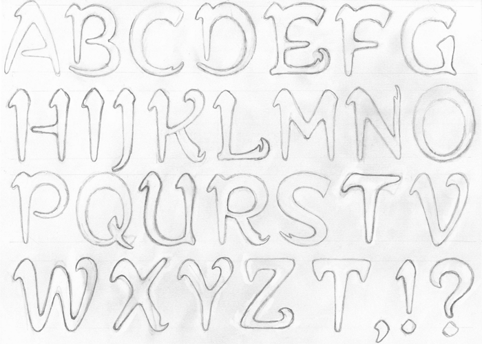
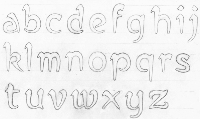
With a typeface like Alphonse Mucha that looks like it’s drawn with brushstrokes, do you experiment with letter shapes with ink on paper, or do you work entirely on the computer?
Mucha drew highly stylised brushstrokes, so I didn’t feel the need to use ink or paint, though I tried to preserve the simulated brush style.
If I’m making a more geometric font I’ll tend to design directly on computer, but if it’s a more ornate face I’ll sketch letters in pencil and scan the roughs, which is what I did with Alphonse Mucha.