Designing fonts feels like playing about at a sub-atomic level in some kind of typographical microverse, a godlike noodling with the stuff of creation. Particularly so with New Old English where I would be tampering with tiny particles of history and quite possibly treading on the toes of time. I was aware of impertinently tinkering with things that might best be left untinkered, yet the direct source for my font was not an original blackletter from the Middle Ages, but a mere 150 year old example of Victorian Medievalism where the tampering had already begun.
New Old English was prompted by two Victorian coins, the mid nineteenth century gothic crown and gothic florin, which featured a gothic script lowercase with quite modern looking, short ascenders and descenders enabling it to fit snugly around the queen’s head or heraldic motif.
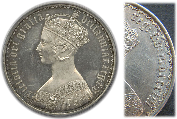
The hairline strokes seemed thicker than normal for Old English typefaces, maybe engraved so to prevent thinner lines from wearing away quickly in circulation. The die-struck lettering had a malleable, less sharp, warmer feel than lettering scripted with a pen. The dots of colons on the coins were rounded rather than the usual rhombic, perhaps again demonstrating the influence of engraving rather than drawing with a pen. So, New Old English initially became an attempt to capture the round-cornered softness of the minted lowercase blackletter.
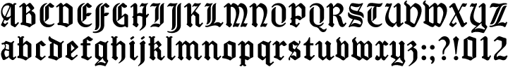
I love the economy and elegance of gothic script lowercase letters, but the uppercase letters often seem too wide and too decorative for a modern sensibility. I could imagine the designer of the gothic crown engraving the lowercase tightly and delightfully around the coin’s circumference, but grimacing at the incongruously fancy capital V required for ‘Victoria’. I was once advised to use the stylistically simpler, though still too wide, Lombardic capitals with my gothic script lettering, an imperfect solution at best.
For New Old English I wanted to create a narrower uppercase that would increase harmony and homogeneity between the cases. So, the uppercase is more condensed than is customary, it has the height and presence of a capital without the excessive width or antiquated flamboyance of the traditional blackletter. It might even allow text set in capitals to look acceptable.