The Bimble typeface wasn’t designed for a specific purpose, the idea was simply to make a fun, friendly, rounded typeface.

Welcome to the Kernel. If you're interested in fonts and the stories behind K-Type faces, this blog offers tender morsels of fonty goodness to satisfy the hungriest typeface gourmet.
The Bimble typeface wasn’t designed for a specific purpose, the idea was simply to make a fun, friendly, rounded typeface.
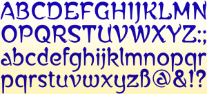
What inspired the design of the Alphonse Mucha font?
The font is based on lettering by the Czech artist Alphonse Mucha for a 1913 concert poster for the cellist Zdeňka Černý. The poster was designed to publicise her European tour to begin in 1914 which had to be cancelled due to the war to end all wars.

With the 2023 Eurovision Song Contest being staged in Liverpool on behalf of Ukraine, the choice of the Penny Lane typeface proved a perfect fit. The fonts are based on twentieth-century cast-iron signs displaying Liverpool street names, and signify the city’s rich musical heritage.
K-Type’s Monterey Pop display face is inspired by Tom Wilkes’s celebrated poster for the 1967 Monterey Pop Festival which heralded the Summer of Love. Although influenced by the psychedelic styles of Wes Wilson, Victor Moscoso, Rick Griffin and others, Wilkes’s lettering is a uniquely individual interpretation of the countercultural vibe.

K-Type Keep Calm is the typeface of choice for BBC quiz show, Richard Osman’s House of Games.

K-Type’s Banks & Miles fonts are inspired by the geometric monoline lettering created for the British Post Office by London design company, Banks & Miles, a project initiated and supervised by partner John Miles. The ‘Post Office Double Line’ alphabet was created in 1970 from sketchbook ideas that John Miles had started working on the previous year.
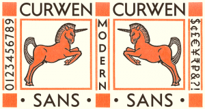
Curwen Sans is a monoline sans-serif dating from the early twentieth century. Though contemporary with Johnston’s Underground and Gill Sans, and emerging from the same artistic milieu, Curwen Sans was created solely for in-house use at the Curwen Press so never achieved a wide audience or recognition.
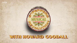
To celebrate the fiftieth anniversary of the Beatles’ Sgt Pepper LP, the BBC broadcast Sgt Pepper’s Musical Revolution with a title, captions and credits that made full use of the K-Type Sgt Peppers fonts.
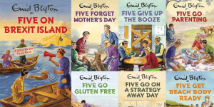
Bruno Vincent’s series of spoofs featuring Enid Blyton’s Famous Five characters continues to proliferate, and K-Type Adventuring was the logical choice of font, being based on the cover capitals from the classic 1950s and 1960s books.
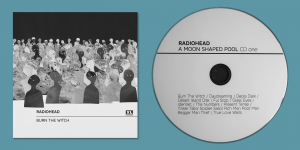
K-Type Deansgate was chosen as the typeface for Radiohead’s 2016 album, A Moon Shaped Pool.
It is surprisingly difficult to find information about the origin of the fonts used for vehicle number plates in Britain. In recent years, the style of typeface has been ambiguously described by UK government agencies as ‘prescribed’, ‘mandatory’ or ’standard’, and it is the general public who have preserved its birth name and a clue to its heritage, largely by word of mouth.
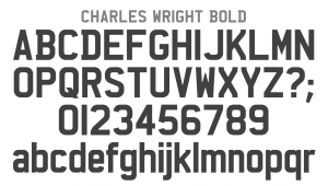
The Deansgate fonts were prompted by some distinctive capital letters used on Manchester street nameplates, a mid-twentieth century style distinguished by a pointy Z, and pointed vertex/apex on the M and W.
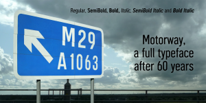
If you’ve driven along a British motorway you’ll be very familiar with the numbers and letters of the Motorway alphabet, partially designed back in the late 1950s but never completed. Until now.
Transport New is K-Type’s redrawing of the typeface created for British road signs. It includes not only the familiar Heavy and Medium weights, but also the previously unreleased Light weight font envisaged for back-lit signage but never actually applied.

K-Type’s Sgt Peppers Lonely Hearts Club typeface, three fonts inspired by the bass drum lettering within the legendary album cover, has a fascinating backstory.
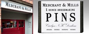
When Merchant & Mills, the English drapers’ supplier, needed a font with a rustic and homely, down-to-earth feel for their products, they turned to K-Type’s recently enlarged Mailart Rubberstamp family to provide just the right sense of traditional, hand-crafted reliability for their delightfully simple, no-nonsense packaging.
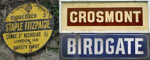
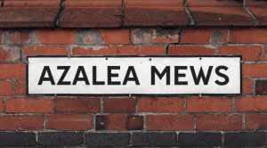
K-Type revives the lost lettering that was widely used for enamel street nameplates, Post Office signs, the plates on James Ludlow wall postboxes, railway signs, direction signs and circular Automobile Association wayfinding plaques for over half a century.
Non Solus, K-Type’s version of Eric Gill’s long neglected ‘light Egyptian’, was overhauled and improved in 2012 using a clearer sample from the January 1948 issue of ‘Alphabet and Image’.

When I first saw the Keep Calm and Carry On poster, I wrongly assumed the letters to be Gill Sans. K-Type Keep Calm is a whole family of fonts developed from the now famous World War 2 poster that was designed in 1939 but never issued, then rediscovered in 2000.
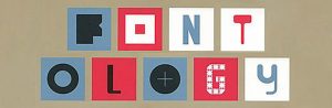
‘Fontology’ by Maia Francisco, has been released by European publisher Promopress, and includes eight K-Type fonts: Designer Block, FlatPack, Insecurity, Kato, Klee Capscript, Mailart, Roadway and Sans Culottes.

K-Type Mandatory has been chosen for Brazilian vehicle plates from 2012 until the introduction of the Mercosur standard in 2018.
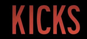
Lindy Heymann’s movie ‘Kicks’ received wide critical acclaim and K-Type Roadway is the director’s choice of font for the title, credits and publicity captions.
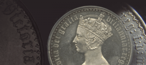
New Old English was prompted by two Victorian coins, the mid nineteenth century gothic crown and gothic florin, which featured a gothic script lowercase with quite modern looking, short ascenders and descenders.
Designer Mike Kus delivered an inspirational presentation at the FOWD conference in London, making great use of K-Type’s Roadway font based on the typeface used for New York street signage.

K-Type Norton, inspired by the famous Norton motorcycles logo, is the choice of typeface for “Old Man Stewart” on top US satire, The Daily Show.

Artist Nina Edge chose to use K-Type Blue Plaque for her ‘5 Dimensional Everything’ art game at the Liverpool Tate Gallery.
Artist Stanley Donwood sent us his Glastonbury T-Shirt design which uses our Norton font.

The Liverpool Tate Gallery’s ‘Summer of Love’ exhibition inspired several K-Type fonts with magical posters by Rick Griffin, Wes Wilson and Victor Moscoso.
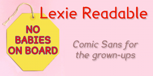
Lexie Readable is a family of fonts designed for maximum legibility, it’s an attempt to capture the clarity and accessibility of Comic Sans without the American comic book associations and whimsical childlike quality.
In 2003, whilst researching the life and work of Eric Gill, I came across several references to an obscure typeface called ‘Solus’, cut in 1929 and withdrawn by Monotype in 1967.