K-Type’s Banks & Miles fonts are inspired by the geometric monoline lettering created for the British Post Office by London design company, Banks & Miles, a project initiated and supervised by partner John Miles. The ‘Post Office Double Line’ alphabet was created in 1970 from sketchbook ideas that John Miles had started working on the previous year,
“I had been enjoying myself seeing how far I could push basic geometry in designing an inline alphabet and we decided to develop my original sketches”.
John Miles acknowledges the contributions of David Deadman, Peter Taylor, Colin Banks, and the other designers at Banks & Miles,
“This was mainly my project but I had a lot of help from some very talented people in the studio so in the end it was a Banks & Miles production. I was very keen that it should be visually a monoline letter which meant we had to compensate for the optical illusion between vertical and horizontal line of the same width. This was particularly difficult in the curved letters. Although we used geometric shapes as far as possible there were points at which only free hand rendering would do the trick.”
The brief required that the component parts of the Post Office, which included telecommunications, counter services and the Royal Mail, be visually linked whilst still retaining each individual identity. A shortlist of four companies was selected with each being offered £2000 (worth around £30,000 today) and given around three weeks to prepare their pitch. Banks & Miles’s idea of a distinctive alphabet, in different colours to indicate the distinct parts of the Post Office business, ultimately proved most appealing to the Post Office Design Committee, and in July 1970 their proposal triumphed over distinguished competition from the Design Research Unit, Conran Design and Crosby/Fletcher/Forbes (Pentagram).
The Double Line name emphasised a key aspect of the design; whereas earlier inline styles were created by drawing the inlines through the middle of existing letterforms, John Miles’s letters were designed elegantly around their inlines.
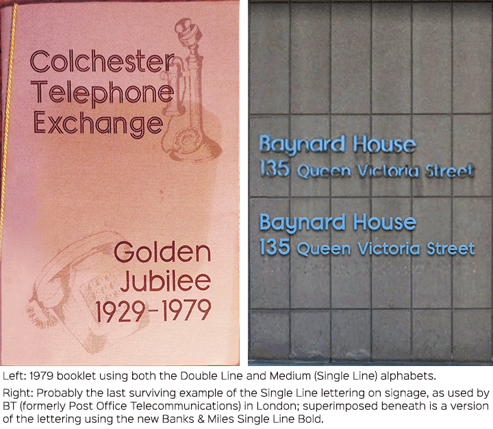
An additional Single Line version called Post Office Medium was created for subheadings and secondary wording, and rather than simply remove Double Line’s inline, the supplementary alphabet was designed anew and slightly condensed where required, though R and k also became more conventional in the process losing their more distinctive Double Line forms, and the number 2 lost its pointed vertex, no longer matching the 4, 7 and Z.
Even after the Post Office was split into separate businesses in the 1980s, Post Office Counters and Royal Mail continued to use the Double Line alphabet, and a version can still be seen within the Royal Mail cruciform logo.
The original lettering was conceived as an alphabet rather than a typeface, so in creating the Banks & Miles fonts, K-Type has necessarily reinterpreted the original letterforms, making changes, aligning the Single Line more closely to its parent, and creating many new glyphs in order to function well as digital type and provide good results in print and on screen. The fonts have been carefully spaced and kerned, and include a full set of Latin Extended-A characters.
I am grateful to John Miles for the inspiration and his recollections about the origin of the alphabets. I am also grateful for the help of Paul Luna at Reading University and Matthew Standage whose dissertation on the lettering proved fascinating and illuminating. Thanks to Andrew Emmerson for suggesting the project, and for providing samples and examples of the Double Line and Medium alphabets.