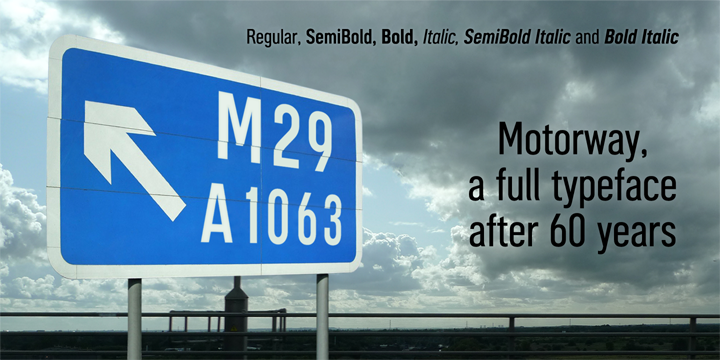
It’s always a delight to come across familiar lettering that has never been made into a proper typeface, and if you’ve driven along a British motorway you’ll be very familiar with the numbers and letters of the Motorway alphabet, partially designed back in the late 1950s but never completed. Until now.

Motorway is the companion typeface to Transport, the British road sign lettering. The Motorway alphabet was created for the route numbers on motorway signage, and is taller and narrower than the accompanying place names and distances which are printed in Transport.
However, for Motorway Jock Kinneir and Margaret Calvert created only the numbers 0 to 9, the capitals A, B, E, M, N, S and W, ampersand, slash, parentheses and a comma. So, although the lettering made its first appearance on the Preston bypass in 1958, K-Type Motorway is the first complete typeface and contains all upper and lower case letters, plus a full complement of numerals, punctuation, symbols and Latin Extended-A accented characters.
As with the Transport alphabet the starting point was Akzidenz Grotesk, Motorway taking inspiration from condensed versions. Changes were mainly driven by a quest for legibility, resulting in some reduced contrast between horizontal and vertical strokes, and Gill-esque straight diagonal limbs on the 6 and 9, and high vertex for the M.
Kinneir and Calvert designed the limited range of characters in two weights; a SemiBold ‘Permanent’ weight for use as white letters on blue motorway signs, and a Bold ‘Temporary’ weight for heavier black letters on yellow non-permanent signage.
In addition to creating full fonts in both original weights, the K-Type family adds a new Regular weight, plus a set of italics, completing a highly usable condensed typeface which, while rooted in history, is fully functional for both print and web usage. The K-Type fonts are spaced and kerned normally, simply increase the tracking to recapture the generous spacing of motorway signage.
The download includes all six fonts; the three weights – Regular, SemiBold (Permanent) and Bold (Temporary) – each with a corresponding italic. The Motorway typeface is the perfect partner to K-Type’s Transport New.
