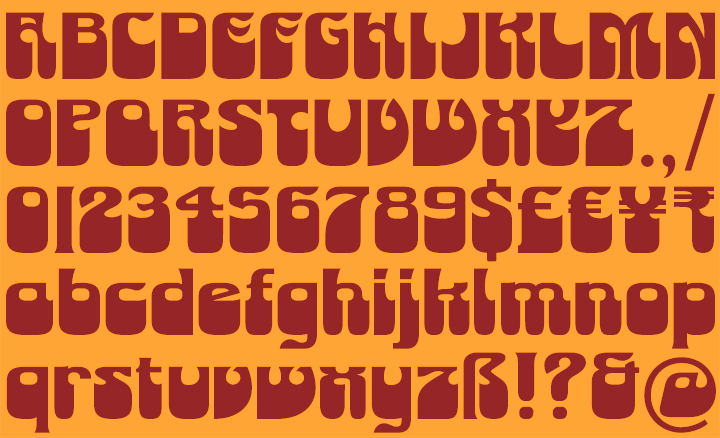
K-Type’s Monterey Pop display face is inspired by Tom Wilkes’s celebrated poster for the 1967 Monterey Pop Festival which heralded the Summer of Love. Although influenced by the psychedelic styles of Wes Wilson, Victor Moscoso, Rick Griffin and others, Wilkes’s lettering is a uniquely individual interpretation of the countercultural vibe.
Lou Adler commented, “Most of the artwork in that particular culture was coming out of San Francisco, and what Tom did was he took a San Francisco look, or niche, and made it international. You can see a lot of the posters from that period and say, ‘Oh, that’s the ‘60s.’ With Tom, it isn’t dated. There’s a very special look to it.” (Los Angeles Times, 2009)
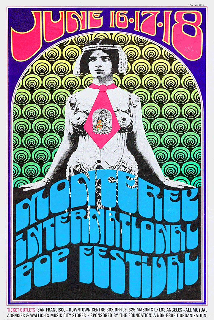
The poster launched a career in design and art direction within the music industry, with Wilkes embracing a wide range of visual styles and amassing an impressive catalogue of record sleeve artwork including Neil Young’s Harvest, and working with photographer Barry Feinstein, Captain Beefheart’s Safe As Milk and George Harrison’s All Things Must Pass album covers. However, Wilkes’s alphabetical inventiveness was never again as inspired and original as it was for his 1967 poster.
The three new fonts remain faithful to Wilkes’s capitals and numerals, add a sympathetically designed lowercase, and include a full repertoire of Latin Extended-A characters. In addition to the normal font, two contour versions are provided – the Outline font works well for darker lines, and the Thinline font is designed for white and tinted outlines which can tend to halo and appear slightly bolder.