K-Type fonts are made using Fontographer, the FontLab company’s mid-level application created with designers in mind. Fontographer boasts superb drawing tools which are intuitive and easy to handle.
The Mac version of Fontographer 5 works on Mac OS X 10.6.8 to macOS 10.14 Mojave, but will NOT work on Macs from 10.15 Catalina onwards. The Windows version works fine on 32-bit and 64-bit versions of Microsoft Windows (XP, 7, 8, 10).
Although the high-end FontLab application might be essential for font engineers, I find its drawing tools unfriendly and cumbersome by comparison, and I’m not alone in preferring to draw designs in Fontographer. ‘Fog’ files can be opened in FontLab if more sophisticated features are required.
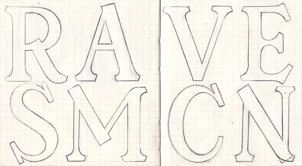
Most K-Types start out as pencil roughs, some start with photographs or other found images, then they’re drawn directly in Fontographer, sometimes traced, with each character being created as a series of vector points and bezier curves in the glyph’s outline window.
Layers
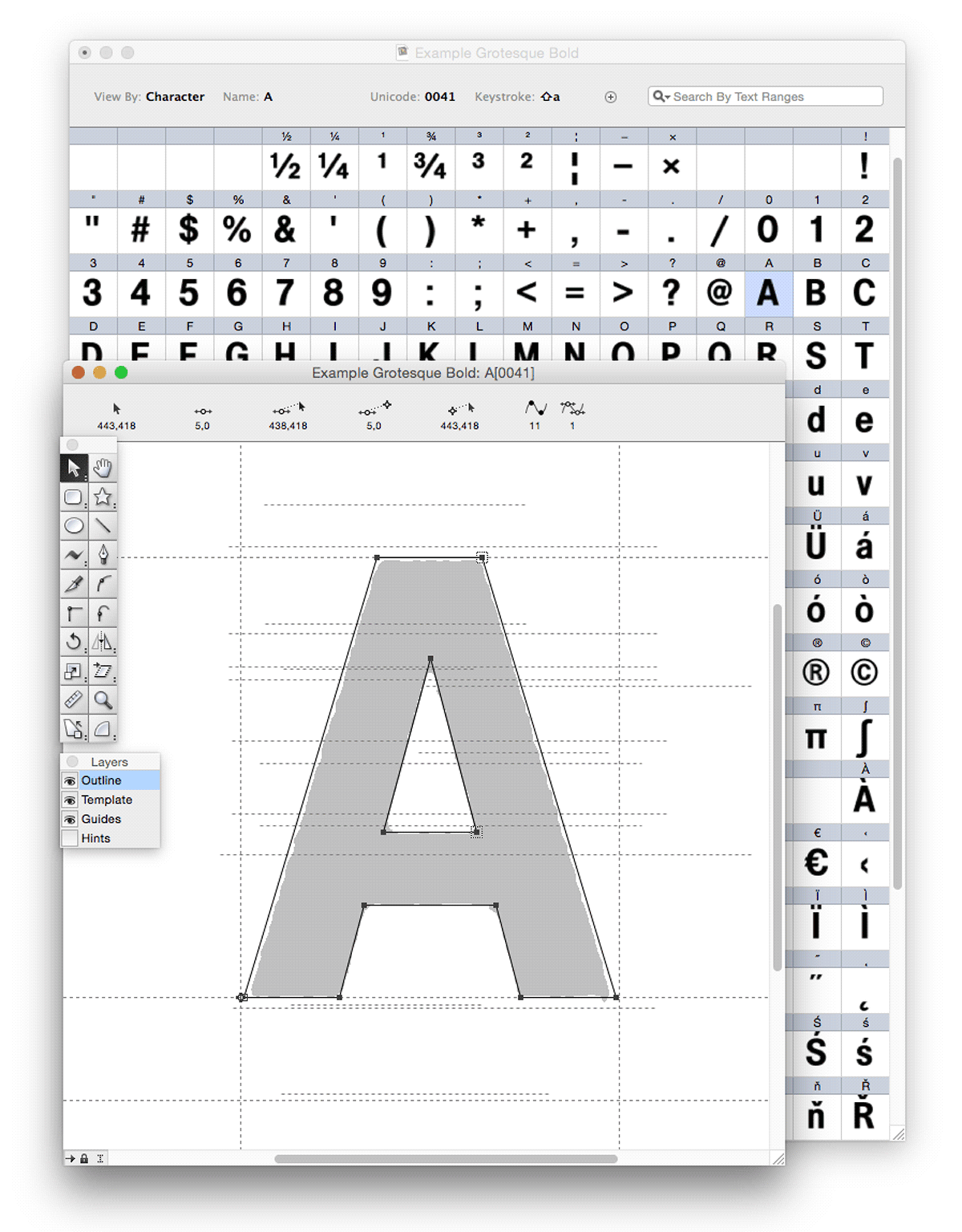
The Outline layer is where glyphs are drawn. Scanned drawings or digital images of individual letters can be copied and pasted onto the Template layer beneath, and you can Auto Trace bitmaps to provide approximate vector points and beziers to push and pull into shape. Or you can simply draw over template shapes.
The Guides layer, below the Outline and Template layers, provides you with a baseline and and origin line. You can set up your own guides for cap height, ascender (often a bit taller than cap height), x-height and descender. You can add other useful guides such as for the overshoot of curved letters above the cap height and x-height, and below the baseline.
The Hints layer is generally ignored, Autohint seems to do a decent job of telling characters how to render on low resolution screens. Apple devices have long ignored in-font hinting in favour of subtle and smooth anti-aliasing, and with the rise of high definition monitors hinting is hopefully being consigned to history. Incidentally, Bitmaps can also be happily ignored, modern font formats don’t use them.
If you have the Fontographer application, open up any OTF or TTF font file to examine the characters in detail in the font window. Open up a character’s outline window and the Layers Palette appears. You can see the glyph’s vectors in the outline window, and you can also access template and guides layers to help with tracing shapes and keeping characters in line.
You’ll notice that there is usually some space left and right of a character called sidebearings, solid verticals requiring more elbow room than open, rounded or slanted characters.
Creating the Outlines
Open up a character’s outline window to view the Tool Palette. Many characters can be created just by using Fontographer’s Rectangle and Oval tools.
Copying and pasting becomes second nature to fontmakers. Select an n, for example, copy and paste it into the u glyph slot. Choose Element > Transform, then Rotate 180° to create the new letter, and nudge it down slightly for some baseline overshoot. Similarly, the b can be flipped horizontally to make a d, and these can be flipped vertically as the basis for p and q.
And you can copy and paste parts of letters to create new ones – add a thin horizontal rectangle to a c for instance and you have the basis of an e. Fontographer’s Element > Remove Overlap command allows you to combine shapes easily.
The Element > Change Weight command is great for creating thinner and thicker versions of a character or a whole font. The feature usually works fine if outlines are well drawn.
There is also a nifty Blend Fonts feature which allows you to select two existing fonts and combine them. This is not only good for wacky experimentation, it’s particularly useful for creating intermediate weights such as a Medium if you already have a Regular and a Bold. This function won’t always get the interpolation right, but it’s reliable most of the time and mistakes are often due to inconsistent outlines.
Clean Up Paths is a useful feature that can keep outlines simple and correctly drawn, especially at lower settings, 1 or 2. But beware, at higher settings it can change shapes adversely.
Font Information
As well as creating a new Fontographer file from scratch, much can be learned by opening up existing fonts and examining the settings and nomenclature used by other designers. There are also exciting possibilities for modifying the characters and creating new typefaces, it’s interesting to rework the outlines of existing fonts and to ponder on the ethical and legal implications.
Choose Element > Font Information to examine the data stored within a font. The Names screen is quite straightforward, though naming big type families can be confused by Windows styling groups being limited to Regular, Italic, Bold and Bold Italic.
The Dimensions screen is where you set heights. The UPM size (em square) of K-Type fonts is always set to 1000 ems. Historically, PostScript favoured 1000 and TrueType 2048. I find it easier to use 1000 because it’s easier to divide up, measure and move guides and space markers in 10 em increments (Fontographer’s preset for a nudge) on the Template and Guides layers. Incidentally, when using the keyboard arrows to nudge, hold down Alt to move a single em unit or Shift for big nudges of 100 ems.
Line Gap is apparently best set to zero.
Older Windows systems had archaic clipping zones which can chop the top and bottom off letters if drawn too big, and I only recently noticed that Fontographer has an antidote to prevent tall glyphs from being cropped in older versions of Microsoft Office – Preferences > Fonts.
The Encoding screen includes the number of characters in the font and you can add to the repertoire as required. Open up a new font and you get a font window containing a basic set of 256 glyph slots and the standard MacOS Roman encoding which K-Type always uses. Recent K-Type fonts have included the Latin Extended-A group of European accented characters and have totalled over 400 characters. The Encoding screen also includes an option to attach an external text file of OpenType features, such as the alternates and swash characters included in K-Type’s Bank of England font.
The Credits and Licensing screens are self-explanatory, and the Recommendations screen is ignorable.
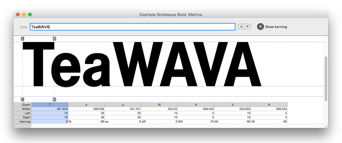
Metrics Window for Spacing and Kerning
Fontographer’s Metrics > Auto Space does a pretty good job at spacing most characters, though you should check and fine tune spacing visually using the metrics window. Auto Space lets you set characters closer or farther apart using a sliding scale, and familiar words typed into the metrics window lets you see the result instantly. Choose Window > Open Metrics Window, or command-K on the keyboard (control-K on Windows). The metrics window enables you to type in values for left and right sidebearings or to manually adjust guides.
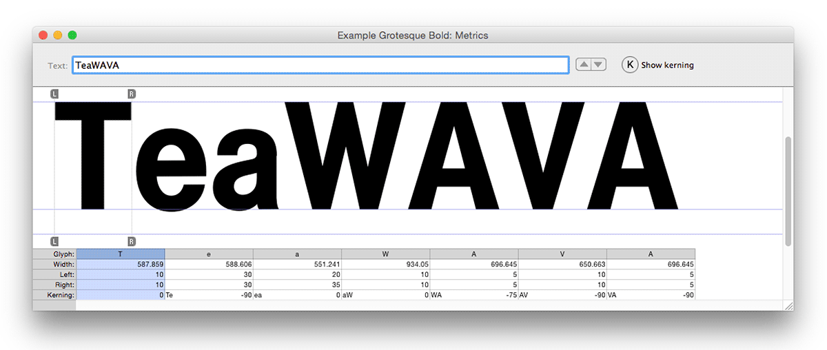
Kerning is done after spacing to correct pairs of characters that are too near or far apart. Fontographer’s Metrics > Auto Kern does a reasonable job, again with a sliding scale that lets you set characters closer or farther apart, but it’s always advisable to check carefully in the metrics window with Show kerning selected. Again, the metrics window enables you to type in a kerning value or to manually adjust a kerning guide. Metrics > Clear Kerning enables you to delete old kerning pairs before resetting. Metrics > Kerning Assistance is useful for grouping together characters that require the same kerning, it’s particularly good for ensuring that accented characters are treated the same as unaccented ones.
Generating Font Files
Fontographer saves files in its own .fog format. When you are ready, fonts can be generated as cross-platform .ttf and .otf files which are most commonly used – File > Generate Font Files.
Before generating, it’s a good idea to select all the glyphs in the font window and choose Element > Correct Path Direction; this ensures that counters (middle bits) display properly, apparently by making outer paths clockwise and inner paths counterclockwise. Hints > Autohint can also be done before generating font files.
Once generated, K-Type fonts are subjected to extensive quality control. Spacing and kerning particularly need close attention. In addition to Fontographer’s metrics window, I use an InDesign document with pages made up of words with troublesome spacing and pair kerning. It’s normal to repeatedly improve and re-generate the font during testing.
Finally, for all its merits and charms, Fontographer can occasionally quit for no apparent reason, so it’s wise to save changes frequently or use the handy Autosaving option in the general preferences. Happy fonting!
Further Reading
Fontographer: Practical Font Design for Graphic Designers – David Bergsland
Andy’s Quick Guide to Fontographer
FontLab VI and Fontographer 5 – full and demo versions
Designing Type – Karen Cheng
A Typographic Workbook: A Primer to History, Techniques and Artistry – Kate Clair
For more of K-Type’s favourite books, check out the Spines
Resources
Mac Keychart (typeco.com)
Windows Keychart (typeco.com)
Combo Keychart (typeco.com)
Font Squirrel Webfont Generator
Polish Diacritics (Adam Twardoch)
Kerning
Jim Gallagher, the legendary ‘Fontmeister’, suggested these letter combinations as the most common problematic pairs:
Av Aw Ay Ta Te To Tr Tu Tw Ty Ya Yo Wa We Wo we yo AC AT AV AW AY FA LT LV LW LY OA OV OW OY PA TA TO VA VO WA WO YA YO
These are less frequently used pairs:
A’ AC AG AO AQ AU BA BE BL BP BR BU BV BW BY CA CO CR DA DD DE DI
DL DM DN DO DP DR DU DV DW DY EC EO F. F, FC FG FO GE GO GR
GU HO IC IG IO JA JO KO L’ LC LG LO LU MC MG MO NC NG NO OB OD
OE OF OH OI OK OL OM ON OP OR OT OU OX P. P, P; P: PE PL PO PP PU
PY QU RC RG RY RT RU RV RW RY SI SM ST SU TC UA UC UG UO US
VC VG VS WC WG YC YS ZO
Ac Ad Ae Ag Ao Ap Aq At Au Bb Bi Bk Bl Br Bu By B. B, Ca Cr C. C, Da D.
D, Eu Ev Fa Fe Fi Fo Fr Ft Fu Fy F; F: Gu He Ho Hu Hy Ic Id Iq Io It Ja Je Jo
Ju J. J, Ke Ko Ku Lu Ly Ma Mc Md Me Mo Mu Na Ne Ni No Nu N. N, Oa Ob
Oh Ok Ol O. O, Pa Pe Po Rd Re Ro Rt Ru Si Sp Su S. S, Tc Ti Tr Ts Tu T. T,
T; T: Ua Ug Um Un Up Us U. U, Va Ve Vi Vo Vr Vu V. V, V; V: Wd Wi Wm Wr
Wt Wu Wy W. W, W; W: Yd Ye Yi Yp Yu Yv Y. Y, Y; Y:
ac ad ae ag ap af at au av aw ay ap bl br bu by b. b, ca ch ck da dc de dg
do dt du dv dw dy d. d, ea ei el em en ep er et eu ev ew ey e. e, fa fe ff fi fl fo
f. f, ga ge gh gl go gg g. g, hc hd he hg ho hp ht hu hv hw hy ic id ie ig io ip
it iu iv ja je jo ju j. j, ka kc kd ke kg ko la lc ld le lg lo lp lq lf lu lv lw ly ma mc
md me mg mo mp mt mu mv my nc nd ne ng no np nt nu nv nw ny ob of oh
oj ok ol om on op or ou ov ow ox oy o. o, pa ph pi pl pp pu p. p, qu q. ra rd r?
re rg rk rl rm rn ro rq rr rt rv ry r. r, sh st su s. s, td ta te to t. t, ua uc ud ue ug
uo up uq ut uv uw uy va vb vc vd ve vg vo vv vy v. v, wa wc wd we wg wh wo
w. w, xe y. y, ya yc yd ye yo ‘A ‘. ‘, .’ ,’ ‘S ‘s “” ’s7,7.
Jim also recommends checking out Bringhurst’s ‘Elements of Typographic Style’ for some good philosophy on kerning.