In 2003, whilst researching the life and work of Eric Gill, I came across several references to a typeface called ‘Solus’ cut in 1929. My curiosity was kindled when I experienced difficulty in finding an illustration of Solus in print or on the internet, and I discovered that the typeface had been withdrawn by Monotype in 1967.
A few meagre visual snippets failed to satisfy and in July 2004 I posted an internet request on the Typophile Forum. To my excitement Alessandro Segalini put up a copy of the Solus typeface from a specimen book, and although it was rather poorly printed at a small point size, I made a ‘Solus Rough’ font to get a feel for the typeface. I liked result and decided to research further, to seek out clearer source material and attempt the first digital version of Solus. I contacted Agfa Monotype by letter and email but got no reply.
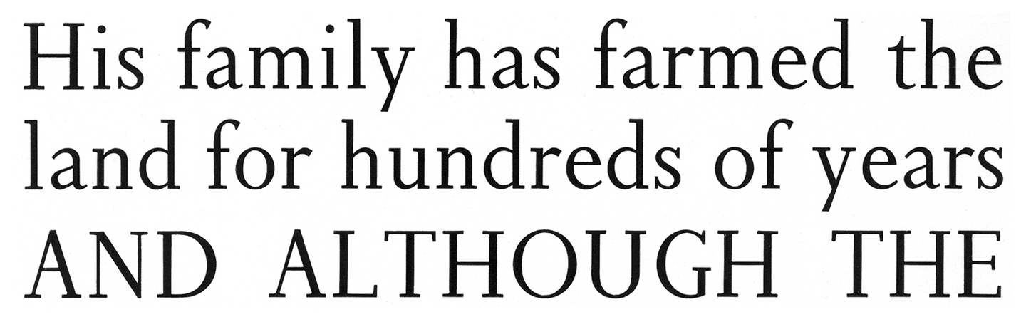
I also made contact with some of the professionals suggested by Alessandro Segalini. Petra Cerne Oven asked Christopher Burke who felt that Solus was superseded by Joanna. James Mosley agreed, but still felt the resurrection of Solus to be an interesting project. I started to compare Solus with Joanna and found it to be more similar to Perpetua in many respects. I also still felt it to have an identity of its own, for me it has a real English schooldays feel.
Justin Howes of the Type Museum, who sadly died early in 2005, noted, “I’ve always liked Solus, and it would be good to see it revived”. Mailartist and printer Alan Brignull sent me a high resolution copy of some Solus characters printed at 48 pt. and I set to work on making a version that was as close to Gill’s original as I could create.
A big problem was the actual shape of the slab serifs. Even at 48 pt. the serifs appear to have slight curved bracketing. I acknowledge that this may well be an error – James Mosley wrote “My impression is that your bracketing, however sutble, is wrong, because Solus is conceived as essentially a mechanistic type — a ‘light Egyptian’.” Even so, I have decided to allow myself to be guided by my observations. Some Egyptians do possess curved brackets, moreover Solus has a warmth compared to Joanna that is augmented by the subtle bracketing visible on the printed copy.
In September, I contacted Robin Nicholas, Head of Typography at Agfa Monotype, and although he didn’t invite me round for a coffee and a detailed look at Gill’s original drawings, he did recommend Gill’s 1926 sketchbook, ‘A Book of Alphabets for Douglas Cleverdon’, as showing the origin of Solus, and I immediately ordered a copy from Amazon. He also noted, ” I understand that there may be a legal problem using the name ‘Solus’.”
Hence Non Solus is born. A typeface which is as near to the spirit of Eric Gill’s Solus as I have been able to make.
See also: Non Solus – Update 2012