The Deansgate fonts were prompted by some distinctive capital letters used on Manchester street nameplates, a mid-twentieth century style distinguished by a pointy Z, and pointed vertex/apex on the M and W.
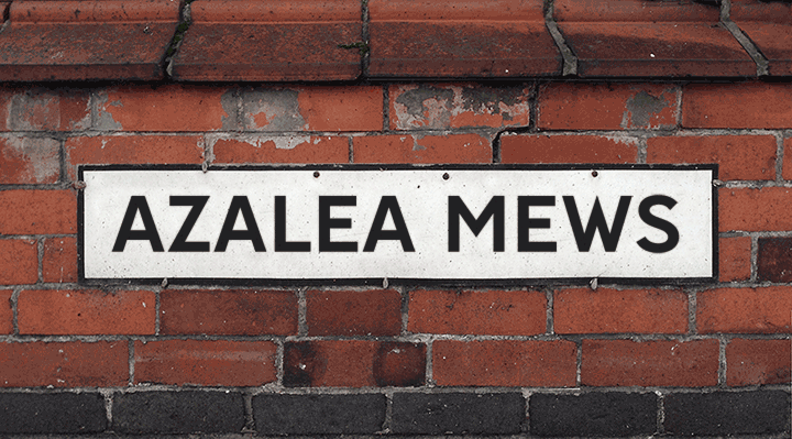
The nameplates are made by Greens/GB Signs at their factory in Wythenshawe using 3 inch dies that were purchased some years ago from a manufacturer who had ceased trading. Sarah Farrell from Greens explains that the identity of that firm “is lost in the mists of time. We’ve had the dies for so long that we just refer to them as ‘the 3 inch MOT ones’ or ‘old car plate dies’. I think they are based on the old Charles Wright font from 1935, but I’m not 100% sure about that.”
Curiously, the street nameplate lettering bears little resemblance to the typeface used for car number plates and commonly referred to as the Charles Wright font. However, Charles’s London-based company of Wright & Son undertook many kinds of metal stamping work, initially making medals and later producing seals and embossing presses, before manufacturing vehicle registration plates and creating the style of lettering still used on vehicles today (see the Kernel article on Charles Wright).
In the early 1930s, the Ministry of Transport with assistance from the British Institute of Industrial Art devised an MoT alphabet to help improve and standardise street nameplates. Wright & Son would have been an ideal choice of manufacturer, and when the company closed down in 1972, some of its dies and pressing equipment could well have migrated up to Manchester.
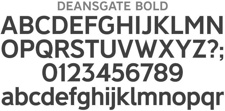
Whatever its origins, Deansgate has an open, welcoming character and is quite British in a Keep Calm, Johnston’s Underground kind of way. It looks less corporate than the older News Gothic Bold that’s also used for Manchester street nameplates, while still possessing the the legible, slightly ’squarified’ round shapes associated with grotesque faces. As well as having the distinctive pointed Z, M and W, Deansgate’s G and K are less congested, and it’s more monolinear, like the Transport typeface, ideal for clear, readable signage. The typeface is available in two widths, Deansgate (normal width) and Deansgate Condensed, and each family includes Regular and Light weights in addition to the signage Bold, each weight being accompanied by a complementary Italic.