K-Type’s Sgt Peppers Lonely Hearts Club typeface, three fonts inspired by the bass drum lettering within the legendary album cover, has a fascinating backstory.
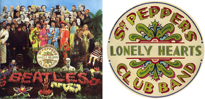
In 1967, the art dealer Robert Fraser suggested to Paul McCartney that the Beatles might commission a fine artist to design the artwork for their forthcoming album, Sgt Pepper’s Lonely Hearts Club Band. Pop artists Peter Blake and Jann Haworth were chosen for the project and Haworth had the idea of displaying the album name on a bass drum,
“The drum, by the way, was part of my thoughts to avoid the dreaded imposition of lettering by a graphic designer. Joe Ephgrave was a fairground painter that I had commissioned to do a number of pieces previously, and he did the drum in the ‘futuristic’ style that was his signature. I still have one of his drawings.”

Ephgrave was asked to submit two alternative painted drum skins for possible use in front of the life-size group of heroes photographed for the album cover. The two paintings were done in March 1967 and the preferred design with Ephgrave’s art deco lettering throughout was chosen for use on the LP sleeve.
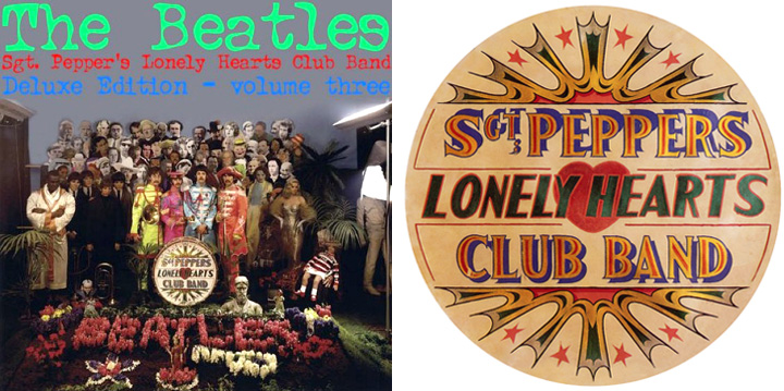
Ephgrave’s other design featured spur serif lettering and was attached to the reverse of the bass drum. This alternative was also photographed and has since been used for the sleeve of a bootleg album.
K-Type’s Sgt Pepper fonts are based on Ephgrave’s ‘futuristic’ art deco style. The Sgt Peppers Lonely Hearts Club font completes the uppercase, adds a lowercase, and includes a full complement of over 400 characters.
The licensed typeface also includes two other fonts, Sgt Peppers Outline and Sgt Peppers Outline Fill, designed to be overlapped for creating bicolor/multicolor effects and faux drums. The Outline and Outline Fill fonts do not contain lowercase characters, instead they comprise two weights of capitals as painted on the Sgt Pepper drum. The uppercase letters are in the wider style from around the outer edge of the drum, and the lowercase keys deliver the more condensed ‘Lonely Hearts’ inline style from the middle of the drum.
The uppercase Y has been flipped to produce a more conventionally acceptable character with the thicker diagonal arm on the left. However, Joe Ephgrave’s reverse Y (with inline) is included in the Outline fonts at the Section keystroke § (Alt-0167 on Windows).