
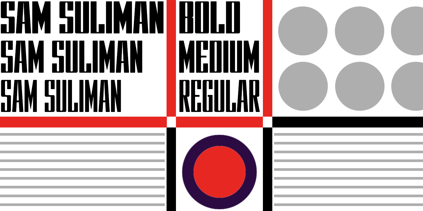

Sam Suliman
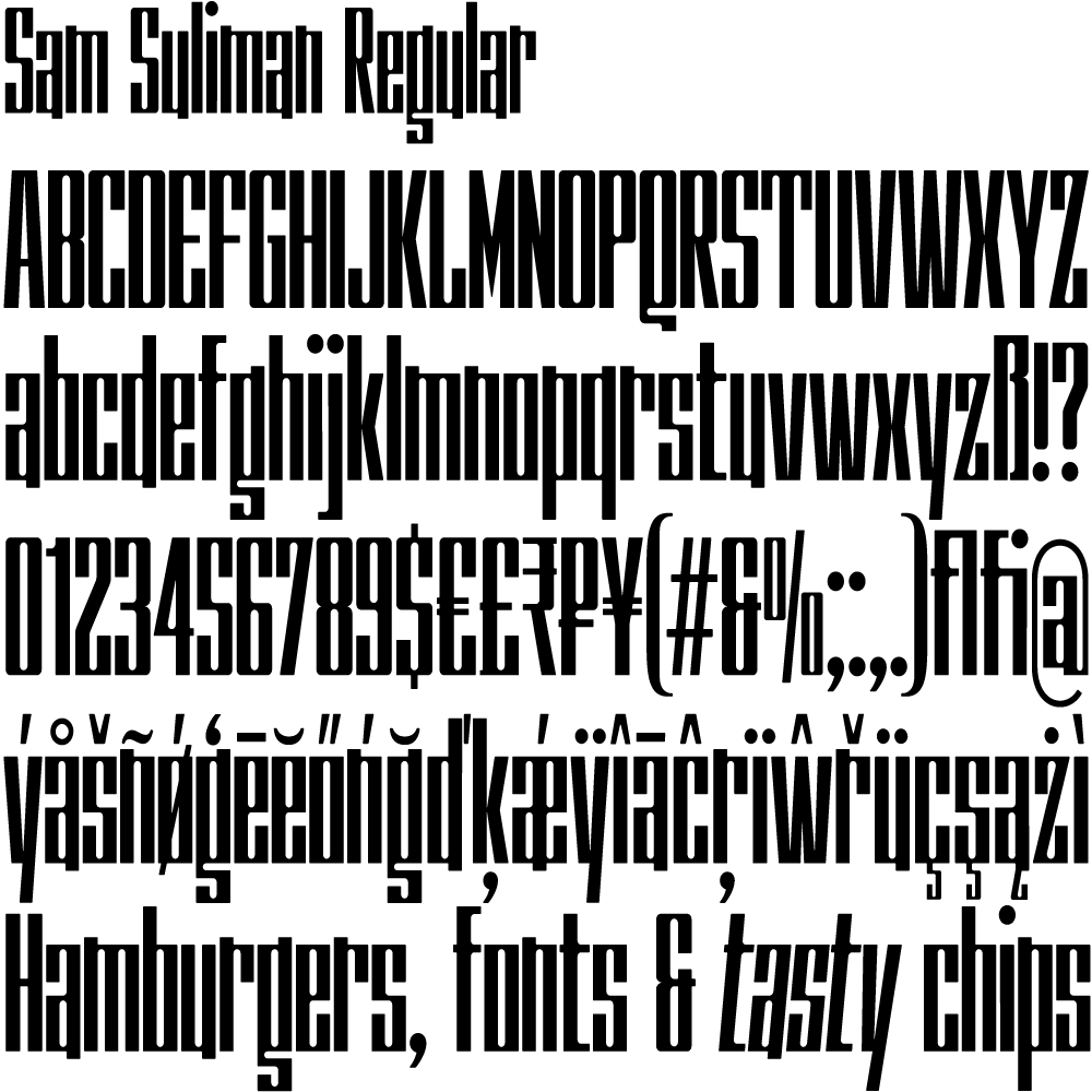
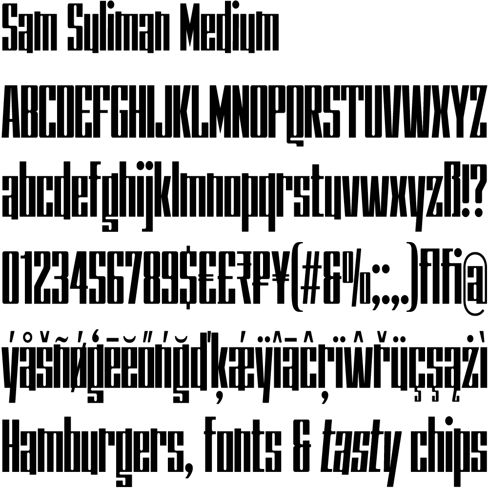
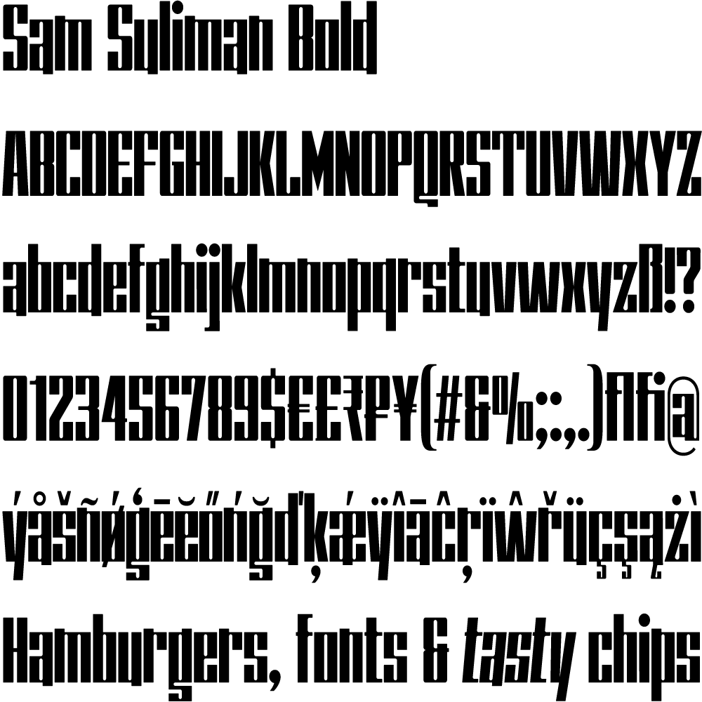
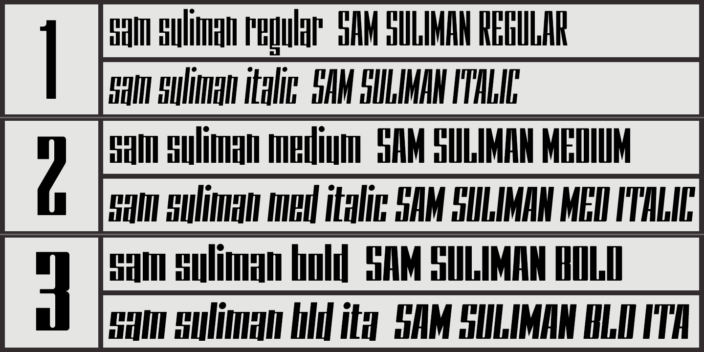
Sam Suliman is a condensed display face supplied in three weights – Regular, Medium and Bold – plus a set of handy italics (obliques). All six fonts are included in the licensed download and the Bold weight is available free for personal use.
The fonts are inspired by lettering on a Sarah Vaughan album cover designed by Sam Suliman in 1962, perhaps influenced by a Solotype font called Herald Square but without that font’s aversion to diagonals, and adding distinctive perky ascenders/descenders on the lowercase r, a, u, g and n. The K-Type fonts also add the nubs to d, m, p, and q.
The ‘Sarah Vaughan’ lettering contrasts sharp tight outer corners with soft rounded inner shapes – the opposite of K-Type Argot where glyphs have curvaceous exterior forms against harsh angular counters.
Suliman was born in Manchester, England in 1927. After working for McCann Erikson in London, he moved to New York where he took on freelance work designing album covers, particularly celebrated are his striking minimalist designs for jazz records. He moved back to England in the early 1960s, designing many book jackets, film titles and fabrics, also working in Spain and India before settling in Oxford in the 1980s.