Summer of Love

Bigfoot

2005 was a Summer of Love in the sunny North West of England, give or take a few rainy fortnights. After having bought a copy of Gastaut and Criqui’s book ‘Off the Wall – Psychedelic Rock Posters from San Francisco’, we went to the Liverpool Tate Gallery and saw their Summer of Love exhibition. The best part was right at the start, a big room filled with those magical hippie posters by Rick Griffin, Wes Wilson, my favourite Victor Moscoso, and others, not forgetting the marvellous Martin Sharp, the Australian artist who lived here in England in the sixties.

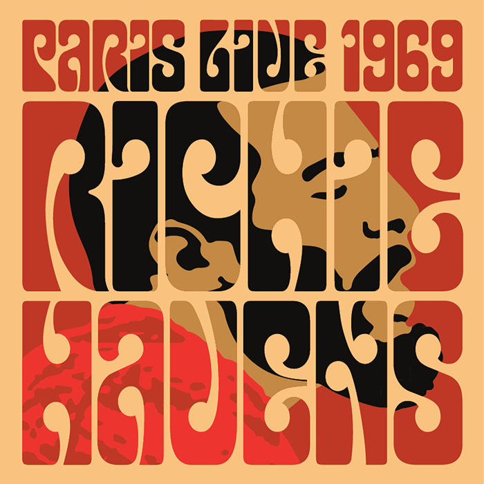
Apart from being stunned by the amazing colours of the original posters, I’d already begun to look closely at Victor Moscoso’s letterforms and start work on a font inspired by the hugely exaggerated slab serifs on posters like his ‘Horns of Plenty’ featuring Quicksilver Messenger Service and Big Brother & the Holding Company. And so K-Type Bigfoot was born, Moscoso-inspired but with a completely new set of lower case letters that were pretty tricky to keep in character.

Then came a beautifully blobby Victor Moscoso font based on the artist’s Moby Grape ‘Neptune’s Notion’ alphabet that has its origins in nineteenth century wood type, the Magical Mystery Tour fonts, and fonts inspired by the lettering of Rick Griffin which feature a new lowercase characters that sit just right. Also, a Wes Wilson font based on the letterforms of the Austrian Secessionist, Alfred Roller.

Lexie Readable

Lexie Readable

Vincent Connare’s Comic Sans arouses great passions. In schools here in England it is held up as the font that children find easiest to read, it is a ubiquitous success story, and its inappropriate use has tormented many a typographer. We confronted our fear and looked into the mouth of the lion. Lexie Readable (formerly Lexia Readable) is a family of fonts designed for maximum legibility, it’s an attempt to capture the clarity and accessibility of Comic Sans without the American comic book associations and whimsical childlike quality which are culturally inappropriate for many uses and may seem patronizing.

Lexie is an attempt to retain the strength, friendliness and legibility of Comic Sans, and even a slightly marker-drawn feel, whilst tidying up the comic book idiosyncrasies. It adds a hint of dignity, a sprinkling of refinement, and introduces elements of designer type to appeal to a contemporary audience.

While Comic Sans has long been a preferred choice for infant typography from ‘Baby on Board’ stickers onward, its use risks undermining any serious message and appearing condescending to readers with greater visual maturity, issues that are particularly acute when applied to adolescent and adult literacy.

Typographical concerns from recent educational publications and discussions, and some highlighted by the British Dyslexia Association have been incorporated into the design of Lexie Readable – the simpler, handwritten forms of a and g, the non-symmetry of letters such as b and d, good sized descenders and ascenders, generous spacing and excellent screen clarity.

Dyslexia.com offer the font from their website, Abigail Marshall commenting,
“I am not utterly convinced that Lexie is superior to ComicSans (my personal favorite), which is also available to our users — but I do have to note that as soon as I converted our site to the Lexie Readable view, I immediately spotted a typographical error on the page that had previously eluded me.
 Lexie has been accepted for inclusion in the site customization feature of the Dyslexia.com web site.”

When information about the typeface was posted on the Typophile Forums, Vincent Connare, suggested a better name might be ‘Our Kid’, maybe ‘Comic Sons’, I suggested. Vincent mentioned that Dalton Maag already had a typeface called Lexia and I’ve recently been persuaded to do the honourable thing and change Readable’s name to Lexie.

The Non Solus Story

In 2003, whilst researching the life and work of Eric Gill, I came across several references to a typeface called ‘Solus’ cut in 1929. My curiosity was kindled when I experienced difficulty in finding an illustration of Solus in print or on the internet, and I discovered that the typeface had been withdrawn by Monotype in 1967.

Solus

A few meagre visual snippets failed to satisfy and in July 2004 I posted an internet request on the Typophile Forum. To my excitement Alessandro Segalini put up a copy of the Solus typeface from a specimen book, and although it was rather poorly printed at a small point size, I made a ‘Solus Rough’ font to get a feel for the typeface. I liked result and decided to research further, to seek out clearer source material and attempt the first digital version of Solus. I contacted Agfa Monotype by letter and email but got no reply.

I also made contact with some of the professionals suggested by Alessandro Segalini. Petra Cerne Oven asked Christopher Burke who felt that Solus was superseded by Joanna. James Mosley agreed, but still felt the resurrection of Solus to be an interesting project. I started to compare Solus with Joanna and found it to be more similar to Perpetua in many respects. I also still felt it to have an identity of its own, for me it has a real English schooldays feel.

Justin Howes of the Type Museum, who sadly died early in 2005, noted, “I’ve always liked Solus, and it would be good to see it revived”. Mailartist and printer Alan Brignull sent me a high resolution copy of some Solus characters printed at 48 pt. and I set to work on making a version that was as close to Gill’s original as I could create.

A big problem was the actual shape of the slab serifs. Even at 48 pt. the serifs appear to have slight curved bracketing. I acknowledge that this may well be an error – James Mosley wrote “My impression is that your bracketing, however sutble, is wrong, because Solus is conceived as essentially a mechanistic type — a ‘light Egyptian’.” Even so, I have decided to allow myself to be guided by my observations. Some Egyptians do possess curved brackets, moreover Solus has a warmth compared to Joanna that is augmented by the subtle bracketing visible on the printed copy.

In September, I contacted Robin Nicholas, Head of Typography at Agfa Monotype, and although he didn’t invite me round for a coffee and a detailed look at Gill’s original drawings, he did recommend Gill’s 1926 sketchbook, ‘A Book of Alphabets for Douglas Cleverdon’, as showing the origin of Solus, and I immediately ordered a copy from Amazon. He also noted, ” I understand that there may be a legal problem using the name ‘Solus’.”

Hence Non Solus is born. A typeface which is as near to the spirit of Eric Gill’s Solus as I have been able to make.

See also: Non Solus – Update 2012