This post is an adjunct to The Non Solus Story written in 2005, a year after the project to recreate Eric Gill’s Solus typeface began.
Non Solus, K-Type’s version of Eric Gill’s long neglected ‘light Egyptian’, was overhauled and improved in 2012 using a clearer sample kindly sent to me by Simon Gooch, an even higher resolution image of the 48pt uppercase and lowercase letters from the January 1948 issue of ‘Alphabet and Image’.
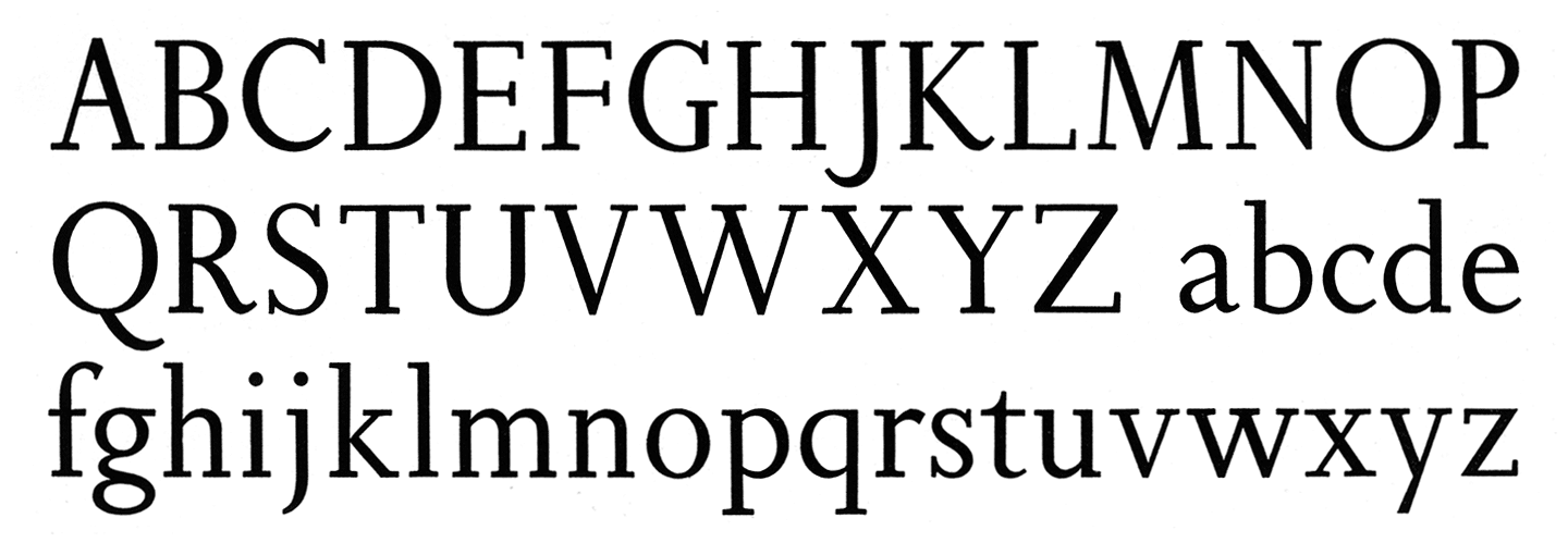
In response to the new sample I decided to slightly reduce the weight of the Regular weight and made many outline, spacing and kerning refinements, and added more Western European accented characters. The new release also added three new weights, Light, Medium and Bold, and all weights are accompanied by free Italics that are only gently inclined and which, in keeping with other Gill faces, are noticeably condensed.
Non Solus still includes the warm, subtle bracketing of serifs which is clearly visible in printed sources. The bracketing of slab serifs is unusual but not unheard of, as Clarendon confirms, but I still wonder if brackets featured in Gill’s original drawings.
Although the original Solus included the Bold weight, the only sample I could find was a very poor, degraded photocopy image. In Autumn 2011 when planning the update, I again emailed Robin Nicholas at Monotype for any help he might provide, hoping for some clearer images of the Bold weight. Sadly I received no reply, but I nevertheless decided to create a heavier weight albeit based on a poor copy of Solus Bold in conjunction with studies into the differences between the Regular and Bold in two of Gill’s other typefaces, Joanna and Perpetua.
Monotype’s Solus Bold doesn’t appear to be very sensitively cut and, at least on my admittedly dubious samples, seems too close in weight to the Regular. K-Type Non Solus adds a little weight to the Bold which now appears both powerful and elegant, redolent of 1940s black & white film titles.
New Medium and Light weights have also been added to the family, and the development of the Italics that accompany each weight has resulted from the close observation of Gill’s other faces and a degree of extrapolation.
Although I like the ‘Non Solus’ moniker of the K-Type version, I also asked Robin Nicholas if I might use the proper name of the typeface, “I would like to make the new version accurately Solus and using its rightful name would seem both desirable and more honorable to Gill’s memory. The Solus trademark hasn’t been actively defended for 45 years and it is now 83 years since the face was designed”. In the absence of a reply, K-Type’s recreation will continue to be called Non Solus.

Gill’s alternative M is located at the μ key (Alt M on a Mac, Alt-0181 on a PC).