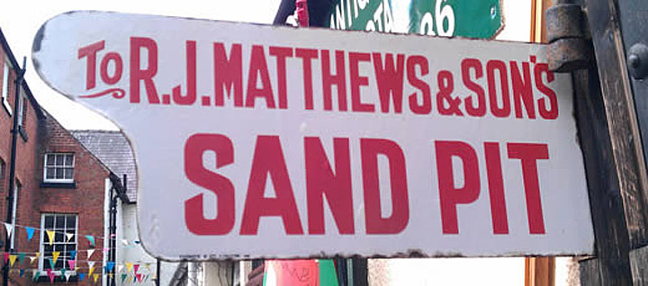
In November 2012 I received an email from Richard Jones in Welshpool suggesting that K-Type create a typeface based on a condensed sans serif he’d observed on old enamel signs. Richard attached this clear photo of one such sign showing particularly intriguing diagonal terminals on the J and S.
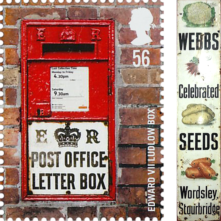
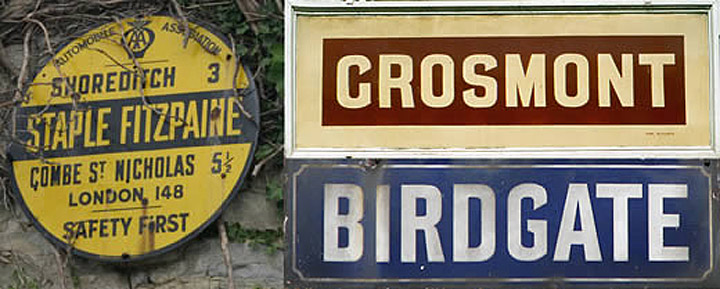
Richard and I embarked on an impromptu campaign of research, discovering that the lettering had been widely used for street signs, Post Office signs, the plates on James Ludlow wall postboxes, railway signs, direction signs and circular Automobile Association wayfinding plaques, with common usage continuing into the 1950s. A rare example of the lowercase was found on a Webbs Seeds enamel.
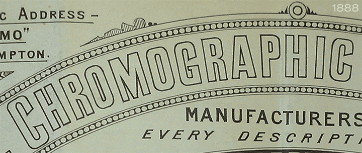
The origin of the lettering dates from the Victorian era. A hand drawn cover design of the Bishop’s Castle Railway dating from 1864 shows how rounded letters are transformed by squashing and squaring off block letters. The 1888 catalogue of the Chromographic Enamel Company of Wolverhampton displays an outline version the style.

A Cherry Blossom Boot Polish enamel advertising sign on the Advertising Antiques website is estimated to date from 1880. Between 1908 and 1915 the lettering was used on ‘bull’s eye’ station signs for London Underground prior to the introduction of Johnston’s Underground type.

The quirky terminals stemming from the compression of geometric type invite comparison with the Charles Wright vehicle registration plate font. Alistair Hall of the London design company ‘We Made This’ also went On the trail of the angled terminal and identified Venus Extra Bold Condensed from the German Bauer Foundry around 1916 as a fairly close match with the same sloping terminals. A decorative serif face called Runic with similarly angled terminals was released by Monotype in 1935. Alan Brignull notes the resemblance to a Victorian wood type, also called Runic, with the terminals of rounded letters sloping in the opposite direction.
Whilst the style endured on vitreous enamel signage for many decades, a degree of variation can be observed between different examples, with draughtsmen evidently feeling free to amend the basic letter shapes and exercise individual taste. The lettering sometimes has a hand-crafted quality that suggests the cutting of stencils or templates, perhaps based on a specification sheet.
The middle diagonals of the uppercase M usually extended down to the baseline, becoming rather heavy and congested, but some draughtsmen, as with Richard’s ‘Sand Pit’ sign, started following the Gill /Johnston example of a high-centred ‘Florentine’ M, and this more elegant option has been chosen for the new Enamela typeface, though the alternative M with lower vertex is also provided at the Alt-M (µ) keystroke on a Mac, or Alt-0181 on Windows. While some designers preferred a plain vertical throat on the G, others added a crosspiece to help distinguish it from a C, and the latter is the form chosen for the Enamela fonts. However, the G without the horizontal is also present, assigned Unicode FF27 (full width capital G).
In search of an existing digital font, I sought the help of Luc Devroye in Montreal who identified the closest match as Czech designer František Storm’s Enamelplate D, similarly condensed with the correctly sloping terminals. However, many characters differ substantially from those in local source material, indicating that continental European enamel lettering varied from its British counterpart.
K-Type Enamela is offered in normal width and condensed versions, with a choice of bold, medium and regular weights, each accompanied by a free italic (oblique). The typeface isn’t simply a re-creation, which would hardly be possible since there are so many slight variations, it’s a family based on the best examples found, and which has been updated where appropriate, augmented to suit contemporary needs.